


A step-by-step guide to Bootstrap ReactJS for beginners


Introduction:
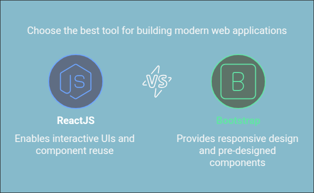
Why Combine ReactJS with Bootstrap?
In today's web development world, developers are constantly looking for efficient and powerful ways to build modern web applications. ReactJS and Bootstrap are two popular tools that developers use to build user interfaces quickly and with ease.
- ReactJS is a JavaScript library for building interactive UIs. It allows developers to create reusable components and manage application state effectively.
- Bootstrap is a front-end framework that provides pre-designed, ready-to-use components, grid systems, and utilities for building responsive and mobile-first websites. It’s a favorite because of its ease of use, wide adoption, and the ability to make your app look great with minimal effort.
Combining ReactJS with Bootstrap allows developers to leverage the benefits of both: the flexibility of React and the ease of creating responsive designs with Bootstrap. In this guide, we’ll walk through how to integrate Bootstrap with ReactJS, helping beginners build beautiful, responsive applications with ease.
Step 1: Setting Up Your React Project
Before you can begin using Bootstrap with React, you need to set up a React application. If you're new to React, follow these steps:
1. Create a New React App: To get started, you'll need Node.js installed on your system. If you don't have it yet, download and install it from nodejs.org.
Once Node.js is installed, use the following command in your terminal to create a new React app:
npx create-react-app my-bootstrap-app
cd my-bootstrap-app
This command initializes a new React app called my-bootstrap-app and installs all the necessary dependencies. Once it’s complete, navigate into the project directory using cd my-bootstrap-app.
2. Start the React App: You can now run the app to verify everything works correctly by typing:
npm startStep 2: Installing Bootstrap
Now that your React app is set up, it's time to install Bootstrap. Follow these steps to install it into your React project:
1. Install Bootstrap using npm:
In the root of your React project, run the following command to install Bootstrap via npm:
npm install bootstrapThis will add Bootstrap to your project and make it available for use.
2. Import Bootstrap CSS:
After installing Bootstrap, you need to include the Bootstrap CSS file in your app to start using its styles. Open the src/index.js (or src/App.js) file and add the following import statement at the top:
import 'bootstrap/dist/css/bootstrap.min.css';Step 3: Using Bootstrap Components in React
One of the main reasons developers love Bootstrap is because of its vast collection of pre-built components. You can easily use these components in your React app to create a beautiful user interface.
Example 1: Creating a Navbar
A responsive navigation bar is a common component in many web applications. With React-Bootstrap, you can easily create one. Here's an example:
import React from 'react';
import { Navbar, Nav } from 'react-bootstrap';

function App() {
  return (
    <Navbar bg="dark" variant="dark" expand="lg">
      <Navbar.Brand href="#home">React-Bootstrap</Navbar.Brand>
      <Navbar.Toggle aria-controls="basic-navbar-nav" />
      <Navbar.Collapse id="basic-navbar-nav">
        <Nav className="ml-auto">
          <Nav.Link href="#home">Home</Nav.Link>
          <Nav.Link href="#features">Features</Nav.Link>
          <Nav.Link href="#pricing">Pricing</Nav.Link>
        </Nav>
      </Navbar.Collapse>
    </Navbar>
  );
}

export default App;
In the code above:
Navbaris the component used to create the navigation bar.Navis used to group the links inside the navbar.Navbar.ToggleandNavbar.Collapseare used to handle responsive collapsible behavior for smaller screens.
Example 2: Using Buttons and Cards
Bootstrap also offers various UI components like buttons and cards. You can easily use them within your React app as follows:
javascriptCopyEdit
import React from 'react';
import { Button, Card } from 'react-bootstrap';

function App() {
  return (
    <div className="container mt-5">
      <Card style={{ width: '18rem' }}>
        <Card.Body>
          <Card.Title>Card Title</Card.Title>
          <Card.Text>
            This is a simple card using React-Bootstrap components.
          </Card.Text>
          <Button variant="primary">Go somewhere</Button>
        </Card.Body>
      </Card>
    </div>
  );
}

export default App;
In this example, you create a Card component that contains a Button. You can customize the text and appearance easily.
Step 4: Using the Grid System for Responsive Layouts
Bootstrap’s grid system allows you to create flexible, responsive layouts. You can divide your screen into up to 12 equal columns. Here's an example of how to use the grid system in a React component:
import React from 'react';
import { Row, Col } from 'react-bootstrap';

function App() {
  return (
    <div className="container mt-5">
      <Row>
        <Col xs={12} md={6}>
          <div className="bg-primary text-white p-5">Column 1</div>
        </Col>
        <Col xs={12} md={6}>
          <div className="bg-secondary text-white p-5">Column 2</div>
        </Col>
      </Row>
    </div>
  );
}

export default App;
Here:
Rowis used to define a row of columns.Coldefines individual columns, which can take up different amounts of space depending on the screen size (xsfor extra small screens,mdfor medium screens).- For example,
xs={12}makes each column span the full width on small screens, whilemd={6}divides the row into two equal columns on medium screens.
Step 5: Customizing Bootstrap with Your Own Styles
While Bootstrap offers a lot of pre-styled components, you may want to make some customizations to fit your project’s unique needs.
Example: Customizing Buttons
Suppose you want to change the color of a button:
Create a custom CSS class, such as:
.btn-custom {
  background-color: #4CAF50;
  color: white;
}
2. Then, use this class with the Bootstrap Button component:
<Button className="btn-custom">Custom Button</Button>This overrides the default Bootstrap button styles and applies your custom styles.
Step 6: Handling Forms in React with Bootstrap
Forms are essential components in most web applications. Bootstrap makes it easy to create stylish and functional forms.
Example: Creating a Simple Login Form
Let’s create a form with a text input for the email, a password field, and a submit button:
import React, { useState } from 'react';
import { Form, Button } from 'react-bootstrap';

function App() {
  const [email, setEmail] = useState('');
  const [password, setPassword] = useState('');

  const handleSubmit = (e) => {
    e.preventDefault();
    console.log('Email:', email);
    console.log('Password:', password);
  };

  return (
    <div className="container mt-5">
      <Form onSubmit={handleSubmit}>
        <Form.Group controlId="formEmail">
          <Form.Label>Email address</Form.Label>
          <Form.Control
            type="email"
            placeholder="Enter email"
            value={email}
            onChange={(e) => setEmail(e.target.value)}
          />
        </Form.Group>

        <Form.Group controlId="formPassword">
          <Form.Label>Password</Form.Label>
          <Form.Control
            type="password"
            placeholder="Password"
            value={password}
            onChange={(e) => setPassword(e.target.value)}
          />
        </Form.Group>

        <Button variant="primary" type="submit">
          Submit
        </Button>
      </Form>
    </div>
  );
}

export default App;You can use Bootstrap’s form components to handle validation, spacing, and layout without needing to worry about writing additional CSS.
Step 7: Advanced Components in React-Bootstrap
After learning the basics, you can explore more advanced components, such as:
- Modals: Used for displaying overlays or dialog boxes.
- Carousels: For creating slide shows.
- Accordions: Used for creating collapsible content areas.
- Tooltips: Small pop-ups for additional information.
For example, to create a simple modal:
import React, { useState } from 'react';
import { Button, Modal } from 'react-bootstrap';

function App() {
  const [show, setShow] = useState(false);

  const handleClose = () => setShow(false);
  const handleShow = () => setShow(true);

  return (
    <div>
      <Button variant="primary" onClick={handleShow}>
        Launch modal
      </Button>

      <Modal show={show} onHide={handleClose}>
        <Modal.Header closeButton>
          <Modal.Title>Modal Title</Modal.Title>
        </Modal.Header>
        <Modal.Body>Content of the modal goes here!</Modal.Body>
        <Modal.Footer>
          <Button variant="secondary" onClick={handleClose}>
            Close
          </Button>
          <Button variant="primary" onClick={handleClose}>
            Save Changes
          </Button>
        </Modal.Footer>
      </Modal>
    </div>
  );
}

export default App;
Conclusion :
By now, you should be comfortable integrating Bootstrap with React and using its components to create responsive and attractive web applications. React-Bootstrap simplifies working with Bootstrap in React, allowing you to focus on building your app without worrying about writing extra CSS or manually managing component states.
I encourage you to explore more advanced React and Bootstrap features and experiment with building more complex layouts and components as you grow your React skills.
 WhatsApp
 Call Us
 Mail Us