


How to Set Up Carousels in React & Best Carousel Components to Choose From


What is a Carousel
A carousel is a way to show a group of pictures or items that you can slide through, usually by clicking arrows or swiping. It's like a rotating display that lets you see multiple things in a small space, like photos in a gallery or products in an online store.

Some simple benefits of using a carousel:
- Saves Space: Carousels let you show multiple images or items without taking up too much room on the page.
- Engages Users: They encourage people to interact by clicking or swiping through content, which keeps their attention longer.
- Highlights Key Items: You can feature important images or products, making them stand out and easily visible.
- Organizes Content: Carousels help keep things tidy and organized, so users can find what they’re looking for more easily.
- Creates Visual Appeal: A well-designed carousel can make a website look more attractive and modern.
- Increases Click-Through Rates: By showcasing multiple options, you can encourage users to explore more and click on items they like.
The best carousel that are widely used :
Here’s an introduction to each carousel library, including their key benefits, main purposes, and unique features:
1. Fullpage.js

- Purpose: Creates full-screen scrolling websites with sections that snap into place.
- Key Benefit: Enhances user experience by allowing smooth navigation through content.
- Unique Feature: Supports horizontal and vertical scrolling, making it ideal for showcasing large amounts of content in a structured way.
2. React Slick
- Purpose: A carousel component for React that enables easy creation of responsive carousels.
- Key Benefit: Simple to implement with a wide range of customization options.
- Unique Feature: Offers a variety of settings such as autoplay, lazy loading, and variable width for items.
3. Pure React Carousel
- Purpose: A lightweight, accessible carousel component for React applications.
- Key Benefit: Provides a simple and straightforward API with no dependencies.
- Unique Feature: Focuses on accessibility, ensuring that the carousel can be navigated easily by keyboard users.
4. Swiper
- Purpose: A powerful mobile touch slider and framework for building modern web applications.
- Key Benefit: Highly customizable and responsive, suitable for all devices.
- Unique Feature: Supports various gestures and effects, including parallax and 3D transitions.
5. React Swipeable

- Purpose: A library for implementing swipeable components in React.
- Key Benefit: Lightweight and easy to integrate for touch interactions.
- Unique Feature: Focuses on touch gestures, allowing for intuitive swiping actions without additional complexity.
6. React Responsive Carousel

- Purpose: A responsive carousel component for React applications.
- Key Benefit: Adjusts automatically based on screen size for optimal viewing.
- Unique Feature: Offers a simple API with built-in swipe support and customizable controls.
7. React Image Gallery

- Purpose: A flexible image gallery component for React applications.
- Key Benefit: Allows users to create responsive galleries with various display options.
- Unique Feature: Supports features like thumbnail navigation, fullscreen mode, and infinite looping.
8. React Flickity

- Purpose: A React wrapper for the Flickity carousel library.
- Key Benefit: Easy integration of Flickity’s features into React applications.
- Unique Feature: Supports multiple layout options, such as containing multiple cells in one view.
9. React Awesome Slider
- Purpose: A flexible slider component for React that supports images and content.
- Key Benefit: Offers a rich set of features with a simple API for customization.
- Unique Feature: Provides unique transition effects, allowing for smooth animations between slides.
10. React ID Swiper
- Purpose: A React implementation of the popular Swiper library, providing touch slider functionality.
- Key Benefit: Combines the power of Swiper with React's component model.
- Unique Feature: Offers an extensive range of configuration options and effects to create unique user experiences.
11. Glide.js
- Purpose: A lightweight JavaScript slider and carousel library.
- Key Benefit: Fast performance with minimal setup requirements.
- Unique Feature: Highly customizable with an easy-to-use API, supporting both horizontal and vertical slides.
These libraries each offer unique advantages and features, catering to different needs when it comes to creating carousels and sliders in web applications.
How to Set Up Carousels in React
I will be showing you three React carousels and how to set them up in a React application. We will be using Tailwind for CSS.
Step 1: Create a React App
If you haven't already set up a React app, use the following commands to create one:
npx create-react-app “name-of-App”Step 2: Install Tailwind CSS
Next, install Tailwind CSS and its dependencies using npm:
npm install tailwindcss postcss autoprefixerStep 3: Configure Tailwind CSS
Create a tailwind.config.js file in the root of your project and configure it:
// tailwind.config.js
module.exports = {
  content: ["./src/**/*.{js,ts,jsx,tsx}", "./public/index.html"],
  theme: {},
  plugins: [],
};
Step 4: Create PostCSS Configuration
Create a postcss.config.js file in the project root:
// postcss.config.js
module.exports = {
  plugins: {
    tailwindcss: {},
    autoprefixer: {},
  },
};
Step 5: Import Tailwind CSS in your styles
Open the src/index.css file and import Tailwind CSS:
/* src/index.css */
@import "tailwindcss/base";
@import "tailwindcss/components";
@import "tailwindcss/utilities";
1. React Slick
Step 6: Install the Package
npm install react-slick --saveYou can include css required for this library in 2 ways
1. Install the slick-carousel package and import css in to your slider component
npm install slick-carousel --saveimport "slick-carousel/slick/slick.css";
import "slick-carousel/slick/slick-theme.css";2.or you can add cdn link in your html
<link
rel="stylesheet"
type="text/css"
charset="UTF-8"
href="https://cdnjs.cloudflare.com/ajax/libs/slick-carousel/1.6.0/slick.min.css"
/>
<link
rel="stylesheet"
type="text/css"
href="https://cdnjs.cloudflare.com/ajax/libs/slick-carousel/1.6.0/slick-theme.min.css"
/>
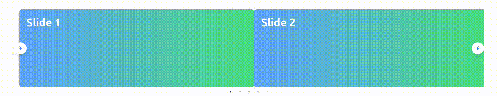
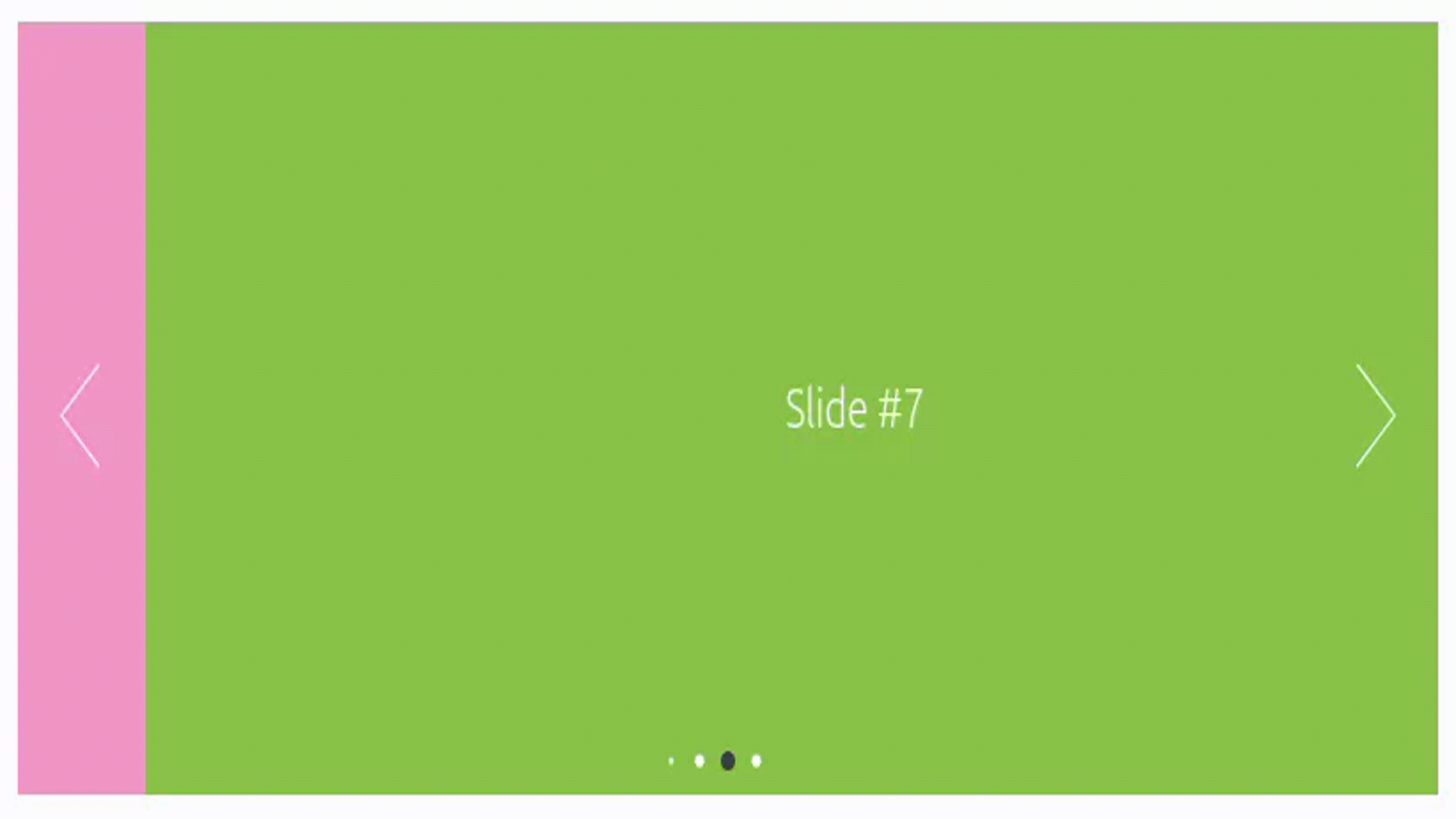
Step 7: Implementation
import React from "react";
import Slider from "react-slick";
import "slick-carousel/slick/slick.css";
import "slick-carousel/slick/slick-theme.css";
export default function SimpleSlider() {
var settings = {
dots: true,
infinite: true,
speed: 500,
slidesToShow: 1,
slidesToScroll: 1,
};
return (
<Slider {...settings}>
<div>
<h3>1</h3>
</div>
<div>
<h3>2</h3>
</div>
<div>
<h3>3</h3>
</div>
<div>
<h3>4</h3>
</div>
<div>
<h3>5</h3>
</div>
<div>
<h3>6</h3>
</div>
</Slider>
);
}
Output:
2. Pure React Carousel
Step 8: Installation
npm i -S pure-react-carouselStep 9: Import the required components into your project.
import React from "react";
import {
  CarouselProvider,
  Slider,
  Slide,
  ButtonBack,
  ButtonNext,
} from "pure-react-carousel";

//Import CSS
import "pure-react-carousel/dist/react-carousel.es.css";
Step 10: Use the CarouselProvider in the Code
import React from "react";
import {
  CarouselProvider,
  Slider,
  Slide,
  ButtonBack,
  ButtonNext,
} from "pure-react-carousel";
import "pure-react-carousel/dist/react-carousel.es.css";

export default class extends React.Component {
  render() {
    return (
      <CarouselProvider
        naturalSlideWidth={100}
        naturalSlideHeight={125}
        totalSlides={3}
      ></CarouselProvider>
    );
  }
}
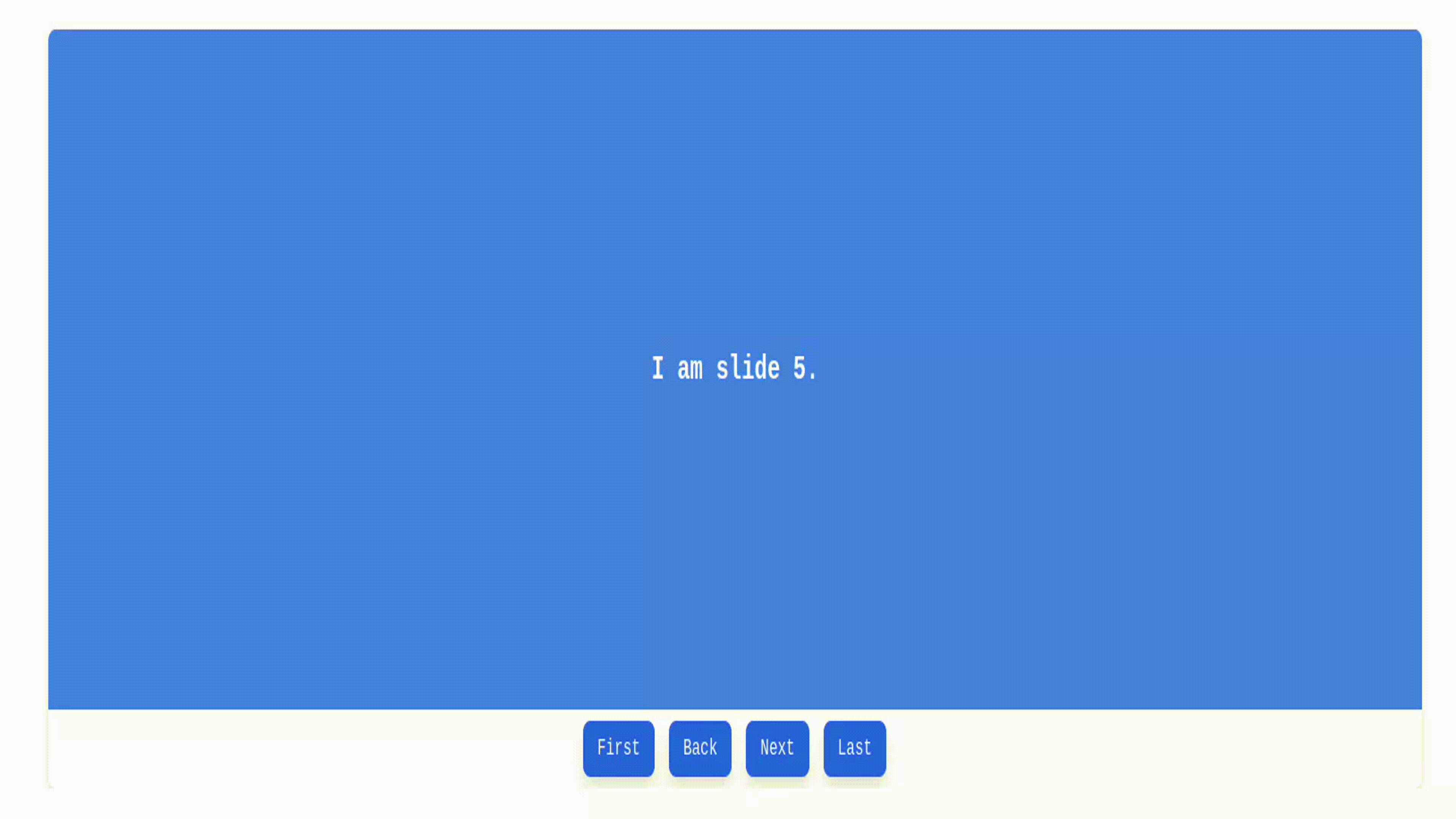
Step 11: Place the components in any order you wish as long as they are children of a single CarouselProvider component.
import React from "react";
import {
  CarouselProvider,
  Slider,
  Slide,
  ButtonBack,
  ButtonNext,
} from "pure-react-carousel";
import "pure-react-carousel/dist/react-carousel.es.css";

export default class extends React.Component {
  render() {
    return (
      <CarouselProvider
        naturalSlideWidth={100}
        naturalSlideHeight={125}
        totalSlides={3}
      >
        <Slider>
          <Slide index={0}>I am the first Slide.</Slide>
          <Slide index={1}>I am the second Slide.</Slide>
          <Slide index={2}>I am the third Slide.</Slide>
        </Slider>
        <ButtonBack>Back</ButtonBack>
        <ButtonNext>Next</ButtonNext>
      </CarouselProvider>
    );
  }
}
Output:
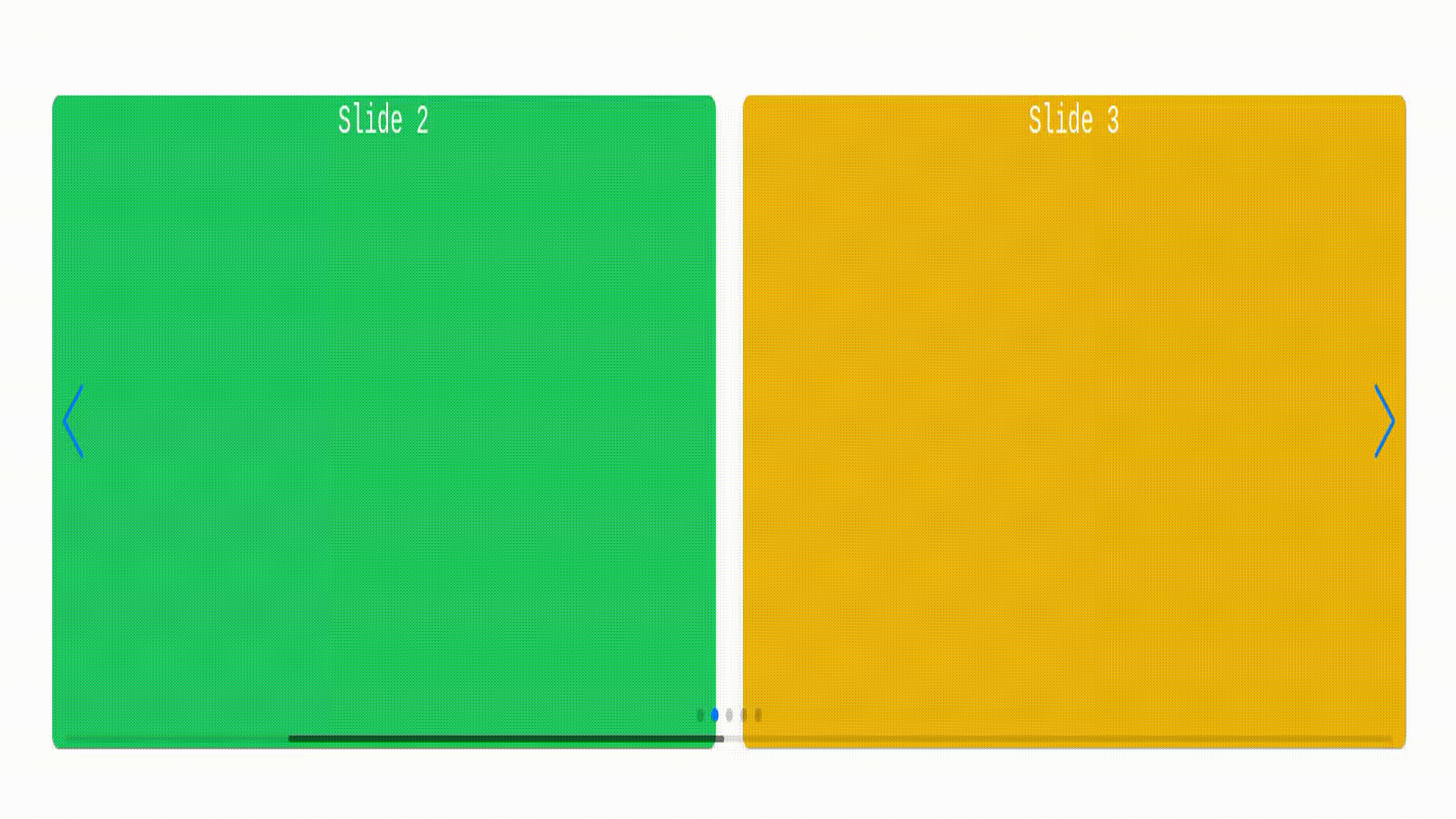
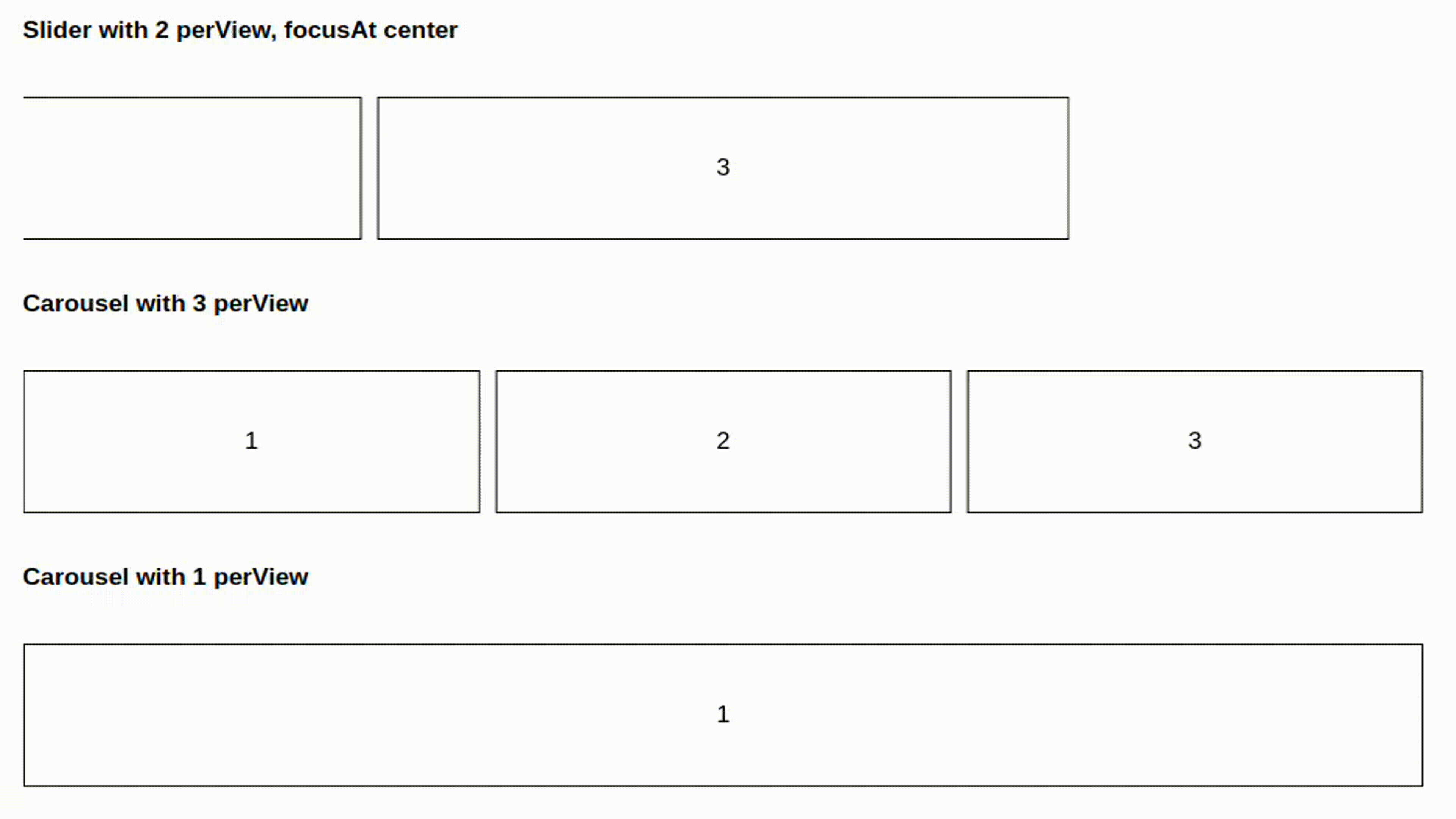
3. Swiper JS
Step 12: Installation
npm i swiperStep 13:Usage
swiper/react exports 2 components: Swiper and SwiperSlide:
// import Swiper core and required modules
import { Navigation, Pagination, Scrollbar, A11y } from "swiper/modules";

import { Swiper, SwiperSlide } from "swiper/react";

// Import Swiper styles
import "swiper/css";
import "swiper/css/navigation";
import "swiper/css/pagination";
import "swiper/css/scrollbar";

export default () => {
  return (
    <Swiper
      // install Swiper modules
      modules={[Navigation, Pagination, Scrollbar, A11y]}
      spaceBetween={50}
      slidesPerView={3}
      navigation
      pagination={{ clickable: true }}
      scrollbar={{ draggable: true }}
      onSwiper={(swiper) => console.log(swiper)}
      onSlideChange={() => console.log("slide change")}
    >
      <SwiperSlide>Slide 1</SwiperSlide>
      <SwiperSlide>Slide 2</SwiperSlide>
      <SwiperSlide>Slide 3</SwiperSlide>
      <SwiperSlide>Slide 4</SwiperSlide>
    </Swiper>
  );
};
Output:
Check out my latest implementation of a React carousel component on GitHub. It features seamless integration with Tailwind CSS for responsive design. You can explore the project and its source code at GITHUB.
Conclusion:
Each React carousel library we explored offers distinct advantages, making them suitable for different use cases. Libraries like Swiper and React Slick are ideal for developers seeking rich feature sets and touch-friendly sliders. Pure React Carousel and React Responsive Carousel provide simple, accessible, and lightweight options, perfect for those prioritizing performance and ease of use. Tools like React Image Gallery and React Awesome Slider focus on creating visually stunning, customizable experiences, while React Flickity and Glide.js shine for developers who need flexibility with multiple layout options. Ultimately, the best carousel for your project depends on your specific requirements mobile responsiveness, accessibility, or unique transition effects. By integrating these libraries with Tailwind CSS, you can create seamless, beautiful carousels that enhance both the look and feel of your React application.
 WhatsApp
 Call Us
 Mail Us