


A Comprehensive Guide on Data Visualization in Python


Introduction
If you're working with data in Python, chances are you've hit a point where numbers alone just don’t cut it. That’s where data visualization steps in — helping you turn raw data into something you can actually see and understand.
Instead of staring at endless rows in a spreadsheet or a DataFrame, you get clear, intuitive visuals that make your insights way easier to share and talk about.
Python makes this part fun. Thanks to its friendly syntax and a solid ecosystem of libraries, it’s super easy to build charts and graphs that not only look good but also help you tell a meaningful story with your data.
In this guide, we’re going to walk through the most widely used Python libraries for data visualization — Matplotlib, Seaborn, Plotly, and even the built-in capabilities of Pandas.
You'll get practical examples, tips that actually help, and a sense of when to use what. Whether you're analyzing a dataset for work, building dashboards, or just getting started with data science, this post will help you turn your data into visuals that make sense — and make an impact.
Why is Data Visualization Important?
Simplifies Complex Data: Raw data can be overwhelming, but visualization makes it easier to understand by converting it into charts, graphs, and plots.
Identifies Patterns and Trends: Visualizations help spot patterns, trends, and outliers, such as detecting time-based trends with line graphs or identifying correlations in scatter plots.
Enhances Decision-Making: By transforming data into clear insights, visualizations help decision-makers make faster and more informed choices.
Improves Communication: Data visualization makes it easier to communicate complex information to both technical and non-technical audiences in an engaging and accessible way.
Facilitates Data Storytelling: Through well-crafted visuals, data tells a story, providing context and showing the impact of decisions or trends.
Promotes Accessibility: Visualizations make data accessible to all stakeholders, enabling data-driven decisions across an organization.
Interactive and Engaging: Interactive dashboards enhance user engagement, allowing deeper exploration of data for better insights.
Popular Python Libraries for Data Visualization
Python has a bunch of solid libraries that make data visualization very appealing and convenient to use. Depending on what kind of chart you’re trying to build — and how interactive or polished you want it to be — there’s probably a tool that fits the job perfectly.
Here’s a quick rundown of the most commonly used ones:
Matplotlib
- This one’s kind of the OG. It’s been around forever and is the go-to for basic plots.
- If you need a simple line graph, bar chart, histogram — anything static — Matplotlib can handle it.
- It’s super flexible (you can tweak just about every part of a plot), but the learning curve can feel a little steep at first.
- Still, a lot of other libraries build on top of it, so it’s good to know your way around.
Seaborn
- Seaborn makes Matplotlib feel a lot more modern and user-friendly. It comes with beautiful default themes, color palettes, and built-in support for common statistical plots — like heatmaps, box plots, and scatter plots.
- If you’re looking to explore data distributions or relationships between variables, Seaborn does a great job with very little code.
Plotly
- Plotly is what you reach for when you want your charts to do something.
- It lets you build interactive plots that users can zoom into, hover over, or even update in real-time.
- It supports a wide range of chart types — from 3D plots and contour maps to geographic visualizations — and it works nicely in web apps or dashboards.
Bokeh
- Bokeh’s another strong choice for interactive visuals, especially if you're working with real-time or streaming data.
- It’s often used in dashboards or web-based apps, and it plays well with frameworks like Flask or Django.
- The setup takes a little getting used to, but the results are smooth and web-ready.
Altair
- Altair keeps things clean and fast. It's great for quickly spinning up visualizations, especially during data exploration.
- Its syntax is declarative, which just means you focus on what you want to show and not how to render it.
- It’s especially handy when you’re working with large datasets and want to explore trends without too much setup.
Loading the Dataset
Before we can start plotting anything, we need some data to work with. In Python, datasets are usually organized like a table — rows are individual records, and columns represent the different features or attributes. Pretty straightforward.
One of the most common starter datasets is the Iris dataset. It’s small, clean, and great for practice. It includes measurements for 150 iris flowers across three different species.
Each entry includes values like sepal length, sepal width, petal length, and petal width — all stuff you can use to spot patterns or differences between the species.
We’ll use this dataset to show how visualizations work with actual data. You’ll see how to load it, explore it a bit, and then start turning those numbers into charts that tell a story.
To load the Iris dataset in Python, we can use libraries like Pandas or directly from Scikit-learn:
import seaborn as sns
import pandas as pd
import matplotlib.pyplot as plt

# Load the dataset
iris = sns.load_dataset('iris')

# Display the first five rows
print(iris.head())
Line Plot: Sepal Length vs. Sepal Width
A line plot connects data points with straight lines to help show how values change — or how they relate to one another — across a continuous variable.
It’s one of the simplest ways to spot patterns, whether you're tracking trends over time or comparing two features side by side.
In this case, we’re using it to compare sepal length and sepal width in the Iris dataset. Even though line plots are often used for time-based data, they can also work well when you're exploring relationships between any two numerical features.
Take a look at the plot below — it shows how these two measurements vary across samples and gives us a quick visual cue on how they differ.
# Line Plot for Sepal Length vs Sepal Width
for species in iris['species'].unique():
    subset = iris[iris['species'] == species]
    plt.plot(subset['sepal_length'], subset['sepal_width'], marker='o', label=species)

plt.title('Sepal Length vs Sepal Width')
plt.xlabel('Sepal Length')
plt.ylabel('Sepal Width')
plt.legend(title='Species')
plt.grid(True)
plt.show()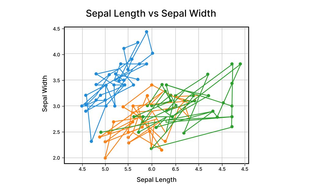
Pair Plot: Visualizing Relationships
Pair plots are a great way to get a bird’s-eye view of how multiple numerical features relate to each other. Instead of plotting just two variables at a time, a pair plot throws them all into one grid — scatter plots for each pair and little histograms or density plots along the diagonal so you can see how each variable is distributed on its own.
This kind of plot is super handy when you’re just getting familiar with a dataset. You can quickly spot patterns, clusters, or possible correlations that might be worth digging into later.
We’ll use a pair plot here to look at all the features in the Iris dataset side by side — so you can see how things like petal length and sepal width relate, and where the differences between species might show up.
sns.pairplot(iris, hue='species')
plt.show()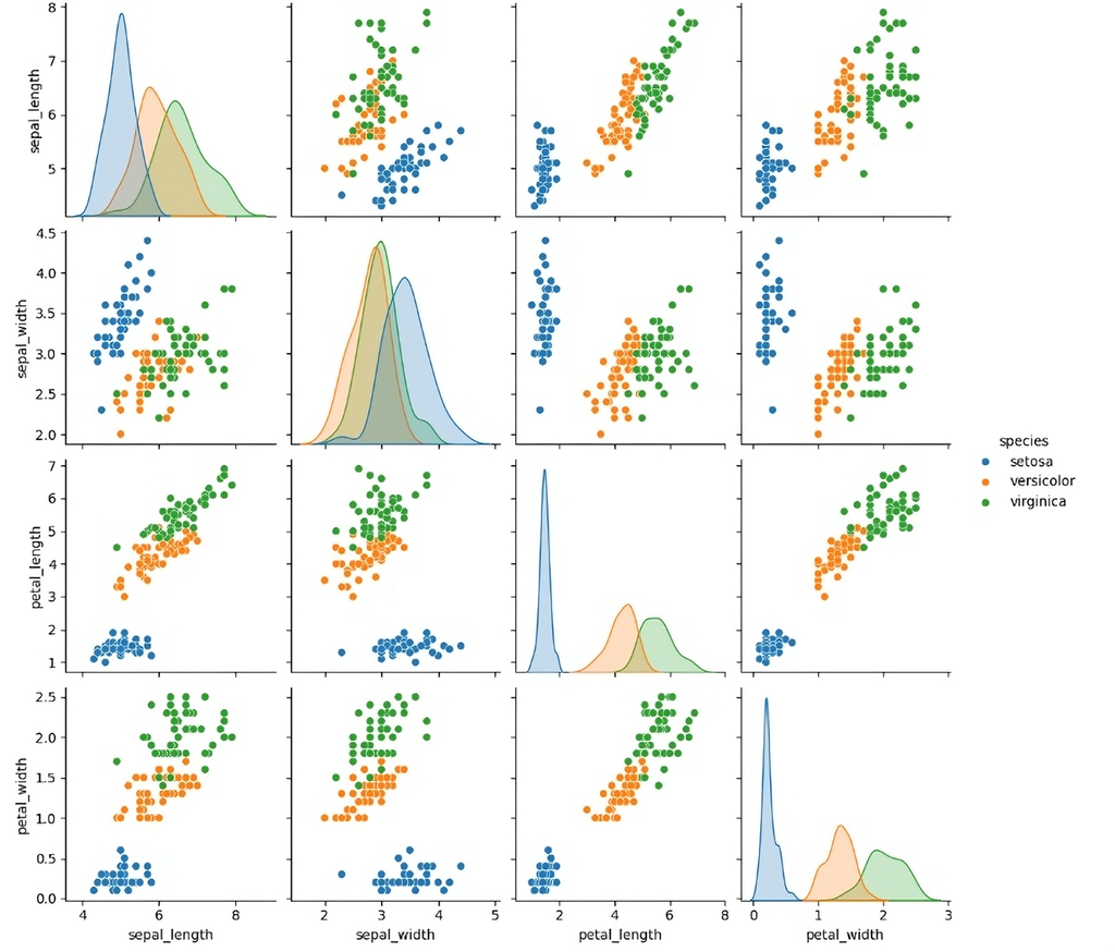
Box Plot: Spotting the Spread and Outliers
Box plots — also called box-and-whisker plots — are a simple way to understand how your data is spread out and whether there are any outliers hanging around. They show key stats like the median, upper and lower quartiles, and the range, all in one compact graphic.
The “box” captures the middle 50% of your data (from the first to the third quartile), while the “whiskers” stretch out to the smallest and largest values that aren’t considered outliers. Anything outside that range usually shows up as a dot — a hint that something might be unusual.
Box plots are super useful when you want to compare groups. For example, when we plot sepal length for different Iris species, it’s easy to spot how the values vary between them, where the bulk of the data sits, and whether any species has more variability or outliers worth noting.
Let’s check out what that looks like in the chart below.
sns.boxplot(x='species', y='sepal_length', data=iris, palette='pastel')
plt.title('Box Plot of Sepal Length by Species')
plt.show().jpg)
Histogram: Sepal Length Distribution
Histograms are one of the easiest ways to see how a set of numbers is spread out. They break the data into chunks — called bins — and show how many values fall into each one. Think of it like sorting your data into buckets and seeing how full each bucket gets.
When we plot a histogram for sepal length in the Iris dataset, we can quickly spot things like where most of the values land, if there are any clear peaks, or if the data’s spread out more than we expected.
A tall bar means a lot of flowers have sepal lengths in that range, while gaps or super short bars might show rare or outlier values.
This kind of plot is perfect for getting a feel for the overall shape of your data — like whether it’s symmetric, skewed, or has more than one peak — and it helps guide what kind of stats or transformations might make sense later.
sns.histplot(iris['sepal_length'], bins=20, kde=True, color='green')
plt.title('Histogram of Sepal Length')
plt.show().jpg)
Scatter Plot: Sepal Length vs. Petal Length
A scatter plot is a visualization used to display the relationship between two continuous variables. It consists of individual data points plotted on a two-dimensional grid, where each point represents a pair of values. The x-axis represents one variable, and the y-axis represents the other.
Scatter plots help identify patterns, correlations, or trends between variables, such as positive or negative relationships, clusters, or outliers.
In the case of the sepal length versus petal length in the Iris dataset, a scatter plot would show how these two variables correlate. If the data points form a clear upward or downward trend, this indicates a relationship between the variables.
For example, in some species, a larger sepal length may correlate with a larger petal length. Scatter plots are valuable for exploring the strength and direction of relationships between continuous variables and are often used in regression analysis or to detect patterns that can guide further data exploration.
import plotly.express as px

fig = px.scatter(iris,
                 x='sepal_length',
                 y='petal_length',
                 color='species',
                 title='Sepal Length vs Petal Length',
                 labels={'sepal_length': 'Sepal Length', 'petal_length': 'Petal Length'},
                 hover_data=['sepal_width', 'petal_width'])
fig.show()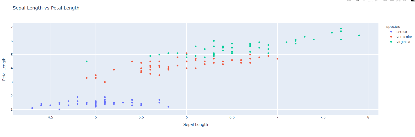
Heatmap: Feature Correlation
A heatmap is a data visualization technique used to display the relationships between multiple numerical variables in a matrix format, where the values of the variables are represented by colors.
The colors typically range from cool (e.g., blue) to warm (e.g., red) to indicate the strength of correlation, with darker colors often representing stronger correlations. Heatmaps are particularly useful for visualizing the correlation matrix of a dataset, where each cell shows the relationship between two variables.
In the case of the Iris dataset, a heatmap of feature correlations can reveal how the different attributes, like sepal length, sepal width, petal length, and petal width, are related to each other.
For example, the heatmap might show a strong positive correlation between petal length and petal width while revealing weaker or negative correlations between other features. Heatmaps allow for quick identification of patterns and relationships between multiple variables, making them an invaluable tool for exploratory data analysis, especially when working with multivariate datasets.
import numpy as np
import seaborn as sns

# Compute the correlation matrix
correlation_matrix = iris.corr()

# Create a heatmap
sns.heatmap(correlation_matrix, annot=True, cmap='coolwarm')
plt.title('Feature Correlation Heatmap')
plt.show().jpg)
Best Practices for Data Visualization
Choose the Right Chart Type:
- Selecting the right chart type is crucial for effectively communicating data. For example, use a bar chart for comparing categories, a line plot for trends over time, and a scatter plot for showing relationships between two continuous variables. Each type of chart is suited to different types of data, so consider the nature of your data before choosing.
Keep It Simple:
- Avoid overloading your chart with unnecessary elements. Stick to the essentials—visualizing key insights clearly and concisely. Too many details or complicated visuals can distract from the main message and make it harder for the audience to draw conclusions.
Use Colors Wisely:
- Colors should be chosen carefully to represent data effectively and maintain consistency throughout the visual. Use colors to differentiate categories, but ensure the color scheme is accessible to those with color blindness. Avoid using too many colors, as it can confuse the viewer. Stick to a simple and intuitive palette.
Label Everything Clearly:
- Proper labels are essential for clarity. Ensure that all axes, titles, legends, and data points are clearly labeled. This will make it easier for viewers to understand the data and context at a glance.
Use Interactive Visualizations:
- Interactive tools like Plotly and Bokeh allow users to explore data more deeply by hovering over points, zooming in, or filtering. Interactive visualizations improve user engagement and make it easier to analyze large datasets.
Conclusion
In conclusion, data visualization is a vital skill in data science and analytics, allowing us to transform complex data into clear, actionable insights. Python libraries like Matplotlib, Seaborn, and Plotly offer powerful tools for creating both static and interactive visualizations.
By exploring the Iris dataset, we've demonstrated various techniques to visualize relationships and distributions within the data. Mastering these tools will enhance your ability to communicate findings effectively.
As next steps, consider exploring advanced libraries like Altair and Bokeh, experimenting with real-world datasets, and building interactive dashboards using tools like Plotly Dash or Streamlit.
Next Steps:
Explore advanced visualization libraries like Altair and Bokeh.
Experiment with real-world datasets for practical application.
Build dashboards using Plotly Dash or Streamlit.
 WhatsApp
 Call Us
 Mail Us