


Exploratory Data Analysis (EDA) with Python's Data Science Stack
 with Python's Data Science Stack.png)

Exploratory Data Analysis (EDA) with Python's Data Science Stack
Imagine you're handed a messy spreadsheet with thousands of rows and columns, what's the first thing you'd do? You wouldn’t start running complex machine learning algorithms right away, right? Instead, you'd take a closer look at the data, try to understand patterns, find missing values, and visualize trends. That’s exactly what Exploratory Data Analysis (EDA) is all about getting familiar with your data before making any decisions.
EDA is the detective work of data science. It helps you uncover insights, detect outliers, and even decide what features are most important for your analysis. Whether you’re working on a personal project or a real-world business problem, EDA is the crucial first step in any data-driven journey.
Introduction to EDA (Exploratory Data Analysis)
What is EDA?
Exploratory Data Analysis (EDA) is the process of examining and visualizing a dataset to understand its main characteristics before applying any machine learning or statistical models. Think of it as a first look at your data checking for patterns, missing values, relationships, and outliers to make informed decisions.
EDA is a crucial step in data science, machine learning, and analytics because it helps uncover insights that might not be obvious at first glance. Without proper EDA, you risk working with dirty, misleading, or incomplete data, which can lead to poor model performance and incorrect conclusions.
 - visual selection (1).png)
Why is EDA important in data science and machine learning?
I've learned the hard way that skipping EDA is like trying to navigate unfamiliar territory without a map. EDA helps you:
Identify data quality issues early (missing values, outliers)
Understand the structure and distribution of your variables
Discover relationships between features
Generate insights that inform feature engineering and modeling choices
As the saying goes in the data community: "Garbage in, garbage out." The quality of your insights and models is directly tied to how well you understand your data.
How EDA helps in understanding data and making better models
When I first started in data science, I was eager to jump straight into modeling. This often led to disappointing results. Through experience, I've found that thorough EDA leads to:
More informed preprocessing decisions
Better feature selection and engineering
Appropriate model selection based on data characteristics
Realistic expectations about model performance
A few hours spent on good EDA can save days of debugging models that were doomed from the start.
Steps for EDA
1. Setting Up the Environment
Installing Python libraries
Python's data science ecosystem makes EDA accessible and powerful. Here are the essential libraries:
# Install the core libraries (run once)
!pip install pandas numpy matplotlib seaborn plotly scikit-learn

# Import libraries for use
import pandas as pd
import numpy as np
import seaborn as sns
import matplotlib.pyplot as plt
# Set plot styling
plt.style.use('seaborn-v0_8')
sns.set_palette("deep")
sns.set_style("white")

# Make plots larger and more readable
plt.rcParams['figure.figsize'] = [10, 6]
plt.rcParams['font.size'] = 12
Using Jupyter Notebook or Google Colab for easy coding
I typically use Jupyter Notebooks for EDA because they allow for:
Interactive code execution
Rich display of visualizations
Documentation with markdown
Easy sharing of analysis
If you don't have a local setup, Google Colab provides a free alternative with similar functionality, plus GPU access for more intensive tasks.
Loading datasets
Let's load a dataset to work with:
import pandas as pd
import numpy as np
from sklearn.datasets import make_regression

# Generate synthetic data
np.random.seed(42)
X, y = make_regression(n_samples=100, n_features=5, noise=0.1)

# Create a DataFrame with meaningful column names
df = pd.DataFrame(X, columns=['Feature1', 'Feature2', 'Feature3', 'Feature4', 'Feature5'])
df['Target'] = y

# Save to CSV
df.to_csv('sample_dataset.csv', index=False)

# Quick peek at the data
print(df.head())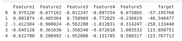
2. Understanding the Dataset
1. Checking dataset structure
The first thing I always do is get a feel for my data's structure:
Before building a model, you need to know:
What kind of data you have (numbers, categories, text, dates).
How many rows and columns are there.
Whether there are missing values or duplicated entries.
For example, if you’re analyzing sales data, EDA helps answer questions like “Do all products have a price listed?” or “Are there duplicate orders?”
# Basic info about the dataset
print(f"Dataset shape: {df.shape}")
print(f"Number of rows: {df.shape[0]}")
print(f"Number of columns: {df.shape[1]}")

# Column names and data types
df.info()

# First few rows
df.head()

# Last few rows
df.tail()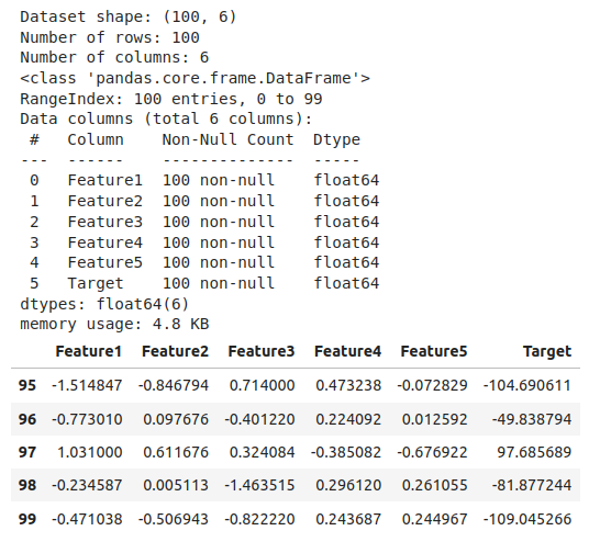
2. Identifying missing values
Missing data can significantly impact your analysis:
# Check for missing values in each column
missing_values = df.isnull().sum()
percent_missing = (missing_values / len(df)) * 100

missing_df = pd.DataFrame({
    'Missing Values': missing_values,
    'Percentage Missing': percent_missing.round(2)
})

print(missing_df[missing_df['Missing Values'] > 0])

# Visualize missing values
import missingno as msno
msno.matrix(df)
plt.title('Missing Value Matrix')
plt.show()
3. Detecting duplicate data
Duplicate entries can skew your analysis:
# Check for duplicate rows
duplicates = df.duplicated().sum()
print(f"Number of duplicate rows: {duplicates}")

# If duplicates exist, we can examine them
if duplicates > 0:
    print("Examples of duplicate rows:")
    display(df[df.duplicated(keep=False)].sort_values(by=list(df.columns)).head())
4. Understanding data types
It's crucial to ensure each column has the appropriate data type:
# Summary of data types
print(df.dtypes.value_counts())

# Detailed view of each column's type
print(df.dtypes)

# Converting types if needed
# df['date_column'] = pd.to_datetime(df['date_column'])
# df['category_column'] = df['category_column'].astype('category')
# df['numeric_column'] = pd.to_numeric(df['numeric_column'], errors='coerce')
3. Summary Statistics & Initial Insights
1. Getting quick statistics
Summary statistics provide a numerical snapshot of your data:
# Descriptive statistics for numerical columns
numerical_stats = df.describe()
print(numerical_stats)

# For categorical columns
if len(df.select_dtypes(include=['object', 'category']).columns) > 0:
    categorical_stats = df.describe(include=['object', 'category'])
    print("\nSummary of categorical columns:")
    print(categorical_stats)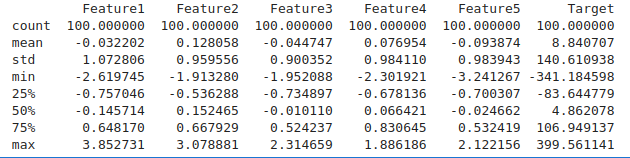
2. Finding patterns in categorical and numerical data
Let's explore basic patterns:
# For categorical data: frequency counts
for column in df.select_dtypes(include=['object', 'category']).columns:
    print(f"\nFrequency count for {column}:")
    print(df[column].value_counts().head())
    print(f"Number of unique values: {df[column].nunique()}")

# For numerical columns: basic statistics
for column in df.select_dtypes(include=['int64', 'float64']).columns:
    q1 = df[column].quantile(0.25)
    q3 = df[column].quantile(0.75)
    iqr = q3 - q1

    print(f"\nStats for {column}:")
    print(f"Min: {df[column].min():.2f}")
    print(f"Max: {df[column].max():.2f}")
    print(f"Mean: {df[column].mean():.2f}")
    print(f"Median: {df[column].median():.2f}")
    print(f"IQR (Interquartile Range): {iqr:.2f}")
3. Checking for data distribution
Understanding the shape of your data distribution is key:
# Calculate skewness for numerical columns
skewness = df.select_dtypes(include=['int64', 'float64']).skew()
print("Skewness of numerical features:")
print(skewness.sort_values(ascending=False))

# Visualization of distributions
plt.figure(figsize=(15, len(df.columns) * 3))
for i, column in enumerate(df.select_dtypes(include=['int64', 'float64']).columns):
    plt.subplot(len(df.columns), 2, i*2 + 1)
    sns.histplot(df[column], kde=True)
    plt.title(f'Distribution of {column}')

    plt.subplot(len(df.columns), 2, i*2 + 2)
    sns.boxplot(x=df[column])
    plt.title(f'Boxplot of {column}')

plt.tight_layout()
plt.show()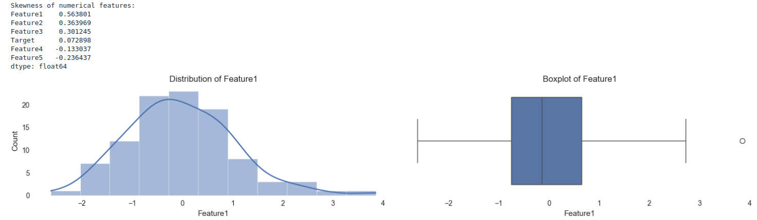
4. Cleaning & Preparing Data
1. Handling missing data
When I encounter missing data, I consider the reason behind the missingness and choose an appropriate strategy:
import pandas as pd
import numpy as np
from sklearn.impute import KNNImputer

# Generate synthetic data
np.random.seed(42)
X, y = make_regression(n_samples=100, n_features=5, noise=0.1)

# Create a DataFrame with meaningful column names
df = pd.DataFrame(X, columns=['Feature1', 'Feature2', 'Feature3', 'Feature4', 'Feature5'])
df['Target'] = y

# Handling missing values
# Option 1: Remove rows with missing values
df_clean = df.dropna()

# Option 2: Fill missing values
# For numerical columns - with mean, median, or mode
df = df.apply(lambda col: col.fillna(col.median()) if col.dtype in ['int64', 'float64'] else col.fillna(col.mode()[0]))

# Option 3: More sophisticated imputation using KNNImputer
imputer = KNNImputer(n_neighbors=5)
df_imputed = pd.DataFrame(imputer.fit_transform(df), columns=df.columns)

# Save to CSV
df.to_csv('sample_dataset.csv', index=False)

# Quick peek at the data
print(df.head())
2. Removing duplicate entries
Duplicates can be legitimate or errors - it's worth investigating before removal:
# Check before and after counts
print(f"Before removing duplicates: {len(df)}")
df = df.drop_duplicates()
print(f"After removing duplicates: {len(df)}")
3. Converting categorical data into numbers
Machine learning models typically need numerical inputs:
# Option 1: Label Encoding (for ordinal categories)
from sklearn.preprocessing import LabelEncoder
le = LabelEncoder()
df['encoded_category'] = le.fit_transform(df['category_column'])

# Option 2: One-Hot Encoding (for nominal categories)
df_encoded = pd.get_dummies(df, columns=['category_column'], drop_first=True)
4. Identifying and removing outliers
Outliers can represent errors or important anomalies:
# Z-score method
from scipy import stats
z_scores = stats.zscore(df.select_dtypes(include=['int64', 'float64']))
abs_z_scores = abs(z_scores)
outlier_rows = (abs_z_scores > 3).any(axis=1)
print(f"Number of potential outlier rows using Z-score: {outlier_rows.sum()}")

# IQR method
def find_outliers_iqr(data):
    q1 = data.quantile(0.25)
    q3 = data.quantile(0.75)
    iqr = q3 - q1
    lower_bound = q1 - (1.5 * iqr)
    upper_bound = q3 + (1.5 * iqr)
    return (data < lower_bound) | (data > upper_bound)

outliers_iqr = find_outliers_iqr(df.select_dtypes(include=['int64', 'float64']))
outlier_rows_iqr = outliers_iqr.any(axis=1)
print(f"Number of potential outlier rows using IQR: {outlier_rows_iqr.sum()}")

# Visualize potential outliers for a specific column
plt.figure(figsize=(10, 6))
sns.boxplot(x=df['column_with_outliers'])
plt.title('Boxplot Showing Outliers')
plt.show()
5. Univariate Analysis (Analyzing One Variable at a Time)
Visualizing numerical data
Let's examine the distribution of individual numerical features:
# Histogram and KDE for continuous variables
plt.figure(figsize=(15, 10))
for i, column in enumerate(df.select_dtypes(include=['int64', 'float64']).columns[:6]):  # Limit to 6 columns
    plt.subplot(2, 3, i+1)
    sns.histplot(df[column], kde=True)
    plt.title(f'Distribution of {column}')
plt.tight_layout()
plt.show()

# Box plots for detecting outliers
plt.figure(figsize=(15, 10))
for i, column in enumerate(df.select_dtypes(include=['int64', 'float64']).columns[:6]):
    plt.subplot(2, 3, i+1)
    sns.boxplot(y=df[column])
    plt.title(f'Boxplot of {column}')
plt.tight_layout()
plt.show()
Analyzing categorical data
I find that visualizing the distribution of categorical variables helps identify imbalances:
# Bar charts for categorical variables
cat_columns = df.select_dtypes(include=['object', 'category']).columns

plt.figure(figsize=(15, len(cat_columns) * 5))
for i, column in enumerate(cat_columns):
    plt.subplot(len(cat_columns), 1, i+1)
    value_counts = df[column].value_counts().sort_values(ascending=False)

    # If too many categories, limit to top 10
    if len(value_counts) > 10:
        value_counts = value_counts.head(10)
        title_suffix = " (Top 10)"
    else:
        title_suffix = ""

    sns.barplot(x=value_counts.index, y=value_counts.values)
    plt.title(f'Frequency of {column} Categories{title_suffix}')
    plt.xticks(rotation=45, ha='right')
    plt.ylabel('Count')
    plt.tight_layout()

plt.tight_layout()
plt.show()
6. Bivariate & Multivariate Analysis (Comparing Multiple Variables)
Finding relationships between numerical variables
Correlation analysis is one of my go-to techniques:
# Calculate correlation matrix
corr_matrix = df.select_dtypes(include=['int64', 'float64']).corr()

# Visualize correlation matrix
plt.figure(figsize=(12, 10))
sns.heatmap(corr_matrix, annot=True, cmap='coolwarm', fmt='.2f', linewidths=0.5)
plt.title('Correlation Matrix of Numerical Features')
plt.show()

# Scatter plots for selected pairs
# Let's find the top correlated pairs
corr_pairs = corr_matrix.unstack().sort_values(ascending=False)
corr_pairs = corr_pairs[corr_pairs < 1]  # Remove self-correlations

plt.figure(figsize=(15, 10))
for i, ((col1, col2), corr) in enumerate(corr_pairs[:6].items()):  # Top 6 correlations
    plt.subplot(2, 3, i+1)
    sns.scatterplot(x=df[col1], y=df[col2], alpha=0.6)
    plt.title(f'{col1} vs {col2} (corr: {corr:.2f})')
plt.tight_layout()
plt.show()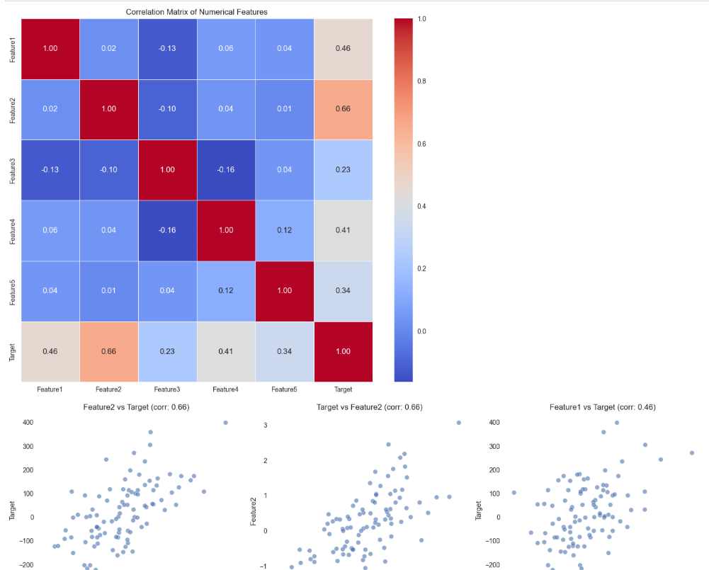
Comparing categorical data
Examining how categorical variables interact:
# For two categorical variables: contingency table and heatmap
if len(cat_columns) >= 2:
    cat1, cat2 = cat_columns[0], cat_columns[1]

    # Create contingency table
    contingency = pd.crosstab(df[cat1], df[cat2])
    print("Contingency table:")
    print(contingency)

    # Visualize
    plt.figure(figsize=(12, 8))
    sns.heatmap(contingency, annot=True, fmt='d', cmap='Blues')
    plt.title(f'Heatmap of {cat1} vs {cat2}')
    plt.show()

# For categorical vs numerical: box plots
if len(cat_columns) > 0 and len(df.select_dtypes(include=['int64', 'float64']).columns) > 0:
    cat_col = cat_columns[0]
    num_col = df.select_dtypes(include=['int64', 'float64']).columns[0]

    plt.figure(figsize=(12, 6))
    sns.boxplot(x=df[cat_col], y=df[num_col])
    plt.title(f'{num_col} by {cat_col}')
    plt.xticks(rotation=45)
    plt.show()

    # Violin plots give more distribution details
    plt.figure(figsize=(12, 6))
    sns.violinplot(x=df[cat_col], y=df[num_col])
    plt.title(f'Distribution of {num_col} by {cat_col}')
    plt.xticks(rotation=45)
    plt.show()
Using pair plots to see how multiple variables interact
When I'm exploring relationships across many variables, pairplots are invaluable:
# Select a subset of columns for readability
subset_cols = df.select_dtypes(include=['int64', 'float64']).columns[:5]  # First 5 numerical columns

# Create pairplot
plt.figure(figsize=(15, 15))
sns.pairplot(df[subset_cols])
plt.suptitle('Pairplot of Key Variables', y=1.02)
plt.show()

# If we have a target variable, we can color by it
if 'target_column' in df.columns:
    sns.pairplot(df[list(subset_cols) + ['target_column']], hue='target_column')
    plt.suptitle('Pairplot by Target Variable', y=1.02)
    plt.show()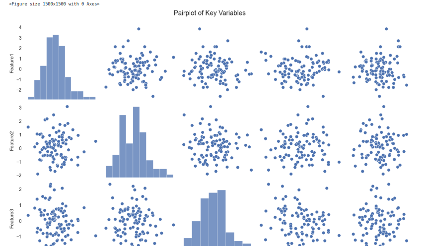
Feature Engineering (Making Data More Useful)
1. Creating new features from existing data
Feature engineering is where data science becomes an art:
# Example: Creating interaction features
df['feature_product'] = df['feature1'] * df['feature2']
df['feature_ratio'] = df['feature1'] / (df['feature2'] + 1e-10)  # Adding small value to avoid division by zero

# Example: Extracting date components
if 'date_column' in df.columns:
    df['day_of_week'] = pd.to_datetime(df['date_column']).dt.dayofweek
    df['month'] = pd.to_datetime(df['date_column']).dt.month
    df['year'] = pd.to_datetime(df['date_column']).dt.year

    # Visualize temporal patterns
    plt.figure(figsize=(12, 6))
    sns.lineplot(x='month', y='target_variable', data=df)
    plt.title('Average Target Value by Month')
    plt.show()

# Example: Binning continuous variables
df['age_group'] = pd.cut(df['age'], bins=[0, 18, 35, 50, 65, 100],
                         labels=['<18', '18-35', '36-50', '51-65', '65+'])
2. Converting text and categorical data into numerical format
Text requires special handling:
# Example: Text feature extraction
if 'text_column' in df.columns:
    # Basic counts
    df['text_length'] = df['text_column'].str.len()
    df['word_count'] = df['text_column'].str.split().str.len()

    # More advanced NLP with TF-IDF
    from sklearn.feature_extraction.text import TfidfVectorizer

    # Initialize the vectorizer
    vectorizer = TfidfVectorizer(max_features=100)

    # Fit and transform the text data
    tfidf_matrix = vectorizer.fit_transform(df['text_column'].fillna(''))

    # Convert to DataFrame
    tfidf_df = pd.DataFrame(tfidf_matrix.toarray(),
                           columns=vectorizer.get_feature_names_out())

    # Now we can use these features for visualization or modeling
    print(f"TF-IDF features shape: {tfidf_df.shape}")
3. Scaling and normalizing data
Scaling ensures fair comparison between features:
# Standardization (z-score normalization)
from sklearn.preprocessing import StandardScaler
scaler = StandardScaler()
df_scaled = pd.DataFrame(
    scaler.fit_transform(df.select_dtypes(include=['int64', 'float64'])),
    columns=df.select_dtypes(include=['int64', 'float64']).columns
)

# Min-Max scaling
from sklearn.preprocessing import MinMaxScaler
min_max_scaler = MinMaxScaler()
df_minmax = pd.DataFrame(
    min_max_scaler.fit_transform(df.select_dtypes(include=['int64', 'float64'])),
    columns=df.select_dtypes(include=['int64', 'float64']).columns
)

# Compare distributions before and after scaling
plt.figure(figsize=(15, 5))
plt.subplot(1, 3, 1)
sns.boxplot(data=df.select_dtypes(include=['int64', 'float64']).iloc[:, :5])
plt.title('Original Data')

plt.subplot(1, 3, 2)
sns.boxplot(data=df_scaled.iloc[:, :5])
plt.title('Standardized Data')

plt.subplot(1, 3, 3)
sns.boxplot(data=df_minmax.iloc[:, :5])
plt.title('Min-Max Scaled Data')

plt.tight_layout()
plt.show()
Advanced Visualization (Making Data More Understandable)
1. Interactive visualizations with plotly
When sharing findings with stakeholders, interactive visualizations make a big difference:
import plotly.express as px
import plotly.graph_objects as go
from plotly.subplots import make_subplots

# Interactive scatter plot
fig = px.scatter(df, x='Feature1', y='Feature2', color='Target',
                hover_name=df.index, title='Interactive Feature Relationship')
fig.show()

# Interactive histogram
fig = px.histogram(df, x='feature1', color='categorical_feature',
                  marginal='box', title='Distribution with Box Plot')
fig.show()

# Interactive correlation heatmap
fig = px.imshow(corr_matrix, text_auto=True, aspect='auto',
               title='Interactive Correlation Matrix')
fig.show()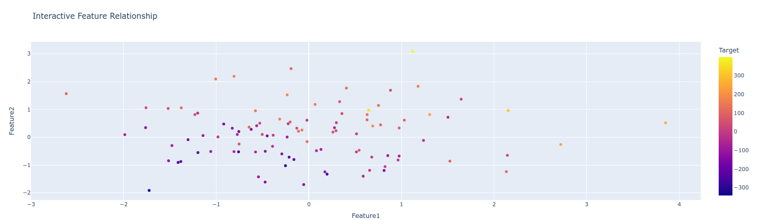
2. Time-series analysis for trends over time
Working with time-based data requires specialized approaches:
# If we have time series data
if 'date_column' in df.columns:
    # Convert to datetime and set as index
    df['date_column'] = pd.to_datetime(df['date_column'])
    ts_df = df.set_index('date_column')

    # Resample to different time frequencies
    daily = ts_df['value_column'].resample('D').mean()
    weekly = ts_df['value_column'].resample('W').mean()
    monthly = ts_df['value_column'].resample('M').mean()

    # Plot the time series at different frequencies
    plt.figure(figsize=(15, 10))

    plt.subplot(3, 1, 1)
    daily.plot()
    plt.title('Daily Average')

    plt.subplot(3, 1, 2)
    weekly.plot()
    plt.title('Weekly Average')

    plt.subplot(3, 1, 3)
    monthly.plot()
    plt.title('Monthly Average')

    plt.tight_layout()
    plt.show()

    # Decompose time series
    from statsmodels.tsa.seasonal import seasonal_decompose

    decomposition = seasonal_decompose(monthly.dropna(), model='additive')

    plt.figure(figsize=(12, 10))
    decomposition.plot()
    plt.suptitle('Time Series Decomposition')
    plt.tight_layout()
    plt.show()
3. Geospatial analysis
Location data opens up another dimension of analysis:
# If we have geographical data (latitude and longitude)
if 'latitude' in df.columns and 'longitude' in df.columns:
    import plotly.express as px

    # Create a scatter map
    fig = px.scatter_mapbox(df,
                          lat='latitude',
                          lon='longitude',
                          color='target_variable',
                          size='value_column',
                          hover_name='location_name',
                          zoom=3)

    # Use open-source map tiles
    fig.update_layout(mapbox_style='open-street-map')
    fig.update_layout(margin={"r":0,"t":0,"l":0,"b":0})
    fig.show()
Automating EDA (Faster Analysis with Tools)
Using pandas-profiling for automatic reports
For quick exploratory analysis, automated tools are lifesavers:
# pandas-profiling creates comprehensive reports
from ydata_profiling import ProfileReport

profile = ProfileReport(df, title="Pandas Profiling Report", explorative=True)

# Save the report
profile.to_file("data_profile_report.html")

# Or display in notebook
profile.to_notebook_iframe()
Exploring sweetviz for quick visual insights
Sweetviz offers comparative analysis capabilities:
import sweetviz as sv

# Create report
my_report = sv.analyze(df)

# Show report
my_report.show_html('sweetviz_report.html')
Trying dtale for interactive data exploration
D-Tale provides an interactive interface for data exploration:
import dtale

# Launch D-Tale with your dataframe
d = dtale.show(df)
d.open_browser()
Conclusion
Exploratory Data Analysis (EDA) is a crucial step in any data science or machine learning project. It helps you understand the structure, quality, and patterns in your data before moving on to modeling. By using Python’s powerful data science stack—pandas, matplotlib, seaborn, and others—you can identify missing values, detect outliers, explore distributions, and uncover relationships between variables.
Skipping EDA can lead to poor model performance and incorrect insights. Investing time in understanding your dataset allows for better preprocessing, feature selection, and ultimately, more accurate models. Whether you're working on a business problem or a personal project, mastering EDA ensures you build a strong foundation for data-driven decision-making.
 WhatsApp
 Call Us
 Mail Us