


Innovate your design with Nuxt & Tailwind


Introduction
When it comes to modern web development, the right combination of tools can elevate your designs and streamline your workflows. Nuxt.js, a progressive framework built on top of Vue.js, and Tailwind CSS, a utility-first CSS framework, are two such tools that together offer unparalleled flexibility and efficiency. This blog will guide you through the process of using these technologies to innovate your design workflow.
What is Nuxt.js?
Nuxt.js is a progressive JavaScript framework built on top of Vue.js. It is designed to simplify the development of modern web applications by providing features such as server-side rendering (SSR), static site generation (SSG), and an opinionated structure for organizing application code. Nuxt.js is especially popular for creating universal applications, which run both on the client and the server, but it is also versatile enough for client-only single-page applications (SPAs) and static websites.
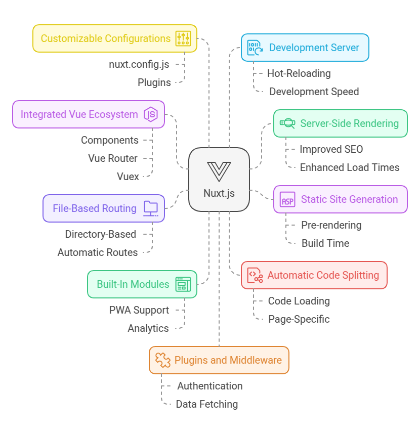
Key Features of Nuxt.js:
Server-Side Rendering (SSR): Automatically renders pages on the server and sends HTML to the client, improving SEO and page load times.
Static Site Generation (SSG): Allows pre-rendering of pages at build time, making it ideal for building fast, SEO-friendly static websites.
File-Based Routing: Simplifies routing with a directory-based convention. Files in the pages/ directory automatically create corresponding routes.
Built-In Modules: Supports features like PWA, authentication, analytics, and more with built-in or community modules.
Automatic Code Splitting: Optimizes application performance by only loading the code necessary for the current page.
Integrated Vue Ecosystem: Works seamlessly with Vue.js features like components, Vue Router, and Vuex for state management.
Customizable Configurations: Provides a highly customizable nuxt.config.js file for adjusting build processes, plugins, and runtime settings.
Development Server: Comes with a hot-reloading development server for fast iteration during development.
Plugins and Middleware: Extensible with plugins to add additional libraries or middleware to handle authentication, data fetching, etc.
Benefits of Using Nuxt.js:
- Improved SEO and performance due to SSR and SSG.
- Simplifies project structure and enforces best practices.
- Saves time with out-of-the-box features and configurations.
- Facilitates faster development cycles and cleaner codebases.
Common Use Cases:
- SEO-Friendly Web Applications: Blogs, e-commerce sites, and marketing pages.
- Static Websites: Documentation sites, landing pages.
- Universal Applications: Apps that require SSR for initial rendering and SPA behavior after loading.
Getting Started:
To start a new Nuxt.js project, you can use the following commands:
npx nuxi init my-nuxt-app
cd my-nuxt-app
npm install
npm run dev
What is Tailwind CSS?
Tailwind CSS is a utility-first CSS framework designed for rapid UI development. Unlike traditional CSS frameworks that come with pre-designed components, Tailwind provides low-level utility classes, giving developers the freedom to design unique interfaces. Tailwind CSS is a highly customizable, utility-first CSS framework designed to make it easier to build modern, responsive, and visually appealing user interfaces.
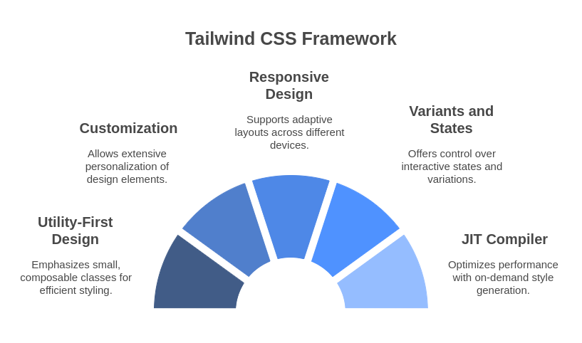
Key Features of Tailwind CSS:
1. Utility-First Design:
- Tailwind offers small, composable classes for common CSS properties like padding, margin, colors, typography, and more.
2. Highly Customizable:
- Tailwind's configuration file (
tailwind.config.js) allows developers to customize the framework to fit their design system. - You can define your own colors, spacing, fonts, and other design tokens.
3.Responsive Design:
- Built-in support for responsive design using intuitive breakpoint modifiers.
4.Variants and States:
- Provides support for hover, focus, active, and other states with simple prefixes.
5. Utility Plugins:
- Includes utilities for animations, shadows, grid layouts, flexbox, transitions, and more.
6. JIT (Just-In-Time) Compiler:
- The JIT compiler generates styles on demand, resulting in smaller CSS bundles and faster builds.
7.No Opinionated Components:
- Unlike traditional frameworks like Bootstrap, Tailwind doesn’t come with pre-designed components, allowing complete design flexibility.
Benefits of Using Tailwind CSS:
- Faster Development: Reduces the need to write custom CSS, enabling rapid prototyping.
- Consistency: Utility classes enforce a consistent design system across the project.
- Responsive and Mobile-First: Simplifies the implementation of responsive design.
- No Naming Conflicts: Eliminates the need for naming classes, reducing CSS bloat.
- Lightweight and Optimized: The
purgefeature ensures that unused CSS is removed in production builds.
Use Cases:
- Web and mobile application UIs.
- Rapid prototyping and design iterations.
- Projects requiring a custom design system.
Getting Started:
To start using Tailwind CSS in a project:
1. Install Tailwind CSS vi
npm install -D tailwindcss postcss autoprefixer
npx tailwindcss init
2. Add tailwind to your CSS:
@tailwind base;
@tailwind components;
@tailwind utilities;
3. Configure the tailwind.config.js file if needed, then run your build process.
<!DOCTYPE html>
<html lang="en">
<head>
  <script src="https://cdn.tailwindcss.com"></script>
</head>
<body class="bg-gray-100 p-6">
  <div class="max-w-md mx-auto bg-white rounded-xl shadow-md overflow-hidden md:max-w-2xl">
    <div class="p-4">
      <h1 class="text-xl font-bold text-gray-900">Welcome to Tailwind CSS</h1>
      <p class="mt-2 text-gray-600">A utility-first CSS framework for rapid UI development.</p>
    </div>
  </div>
</body>
</html>4.Add Custom Screens (Breakpoints): If your design requires custom breakpoints:
theme: {
  screens: {
    'xs': '480px',
    ...defaultTheme.screens,
  },
},
5. Plugins: Add Tailwind plugins to extend functionality, such as forms or typography:
plugins: [
  require('@tailwindcss/forms'),
  require('@tailwindcss/typography'),
],
6. Use Configurations in Nuxt Components: Your custom configurations can now be utilized in your Vue components. For example:
<div class="text-primary bg-secondary p-128">
  Customized Tailwind
</div>
Design Principles with Nuxt & Tailwind
1. Responsive Design
Tailwind’s responsive utilities make it easy to create adaptable layouts. For example:
<div class="grid grid-cols-1 md:grid-cols-2 lg:grid-cols-4 gap-4">
  <div class="bg-gray-100 p-4">Item 1</div>
  <div class="bg-gray-100 p-4">Item 2</div>
  <div class="bg-gray-100 p-4">Item 3</div>
  <div class="bg-gray-100 p-4">Item 4</div>
</div>
This approach ensures that your design looks great on any device.
2. Dark Mode:
Enable dark mode by updating the tailwind.config.js file
darkMode: 'class',Toggle dark mode in your HTML:
<body class="dark:bg-gray-800 dark:text-white">
  <div class="dark:bg-gray-700">Content</div>
</body>
Dark mode enhances the user experience, especially in low-light environments.
3. Custom Themes
Tailwind’s configuration allows you to define custom themes:
module.exports = {
  theme: {
    extend: {
      colors: {
        primary: '#4CAF50',
        secondary: '#FF5722',
      },
    },
  },
};
Custom themes help in maintaining brand identity and consistent design language.
4. Component-Based Design
Nuxt’s modular architecture pairs well with Tailwind for component-based designs. Create reusable components with Tailwind classes for consistent UI patterns. For instance:
<template>
  <div class="p-4 bg-white shadow-md rounded-lg">
    <slot />
  </div>
</template>
This encourages clean, maintainable code and scalable design systems.
Adding Animations and Transitions
Tailwind CSS provides powerful utilities to create animations and transitions for engaging user interfaces.
1. Enable Animations in tailwind.config.js: Extend the animation and keyframes properties to define custom animations:
module.exports = {
  theme: {
    extend: {
      animation: {
        bounce200: 'bounce 1s infinite 200ms',
        fadeIn: 'fadeIn 2s ease-in-out',
      },
      keyframes: {
        fadeIn: {
          '0%': { opacity: 0 },
          '100%': { opacity: 1 },
        },
      },
    },
  },
};
2. Using Animation Utilities: Apply animations to elements in your Nuxt components using Tailwind's animate-* classes:
<div class="animate-fadeIn">
  Welcome to Nuxt with Tailwind!
</div>
3.Transitions: Tailwind offers transition classes to smoothly animate property changes like colors, opacity, and position:
- Basic Transition
<button class="bg-blue-500 text-white p-4 transition-colors duration-300 hover:bg-blue-700">
  Hover me
</button>- Customizing Transition Properties: Extend transition utilities in the
tailwind.config.jsfile:
extend: {
  transitionProperty: {
    height: 'height',
    spacing: 'margin, padding',
  },
},4.Combining Animations and Transitions: Combine the two for dynamic effects:
<div class="animate-bounce200 transition-transform duration-500 hover:scale-110">
  Bounce and Grow
</div>
Best Practices
Purge Unused CSS: Tailwind automatically removes unused styles in production, but ensure your configuration is accurate.
Accessibility: Leverage Nuxt’s SSR and Tailwind’s accessibility utilities to make your application inclusive.
Documentation: Nuxt.js and Tailwind CSS have excellent documentation. Use it to stay updated on best practices and new features.
Conclusion
By combining Nuxt.js and Tailwind CSS, developers can build beautiful, high-performance websites with ease. The flexibility and scalability of these tools make them a powerful choice for any project. Whether you’re a seasoned developer or just starting out, this duo can help you innovate your design process and create impactful digital experiences.
 WhatsApp
 Call Us
 Mail Us