


React Design Patterns for Scalable Frontend Architecture


React offers flexibility in how applications are structured. Components, hooks, and context provide building blocks, but they do not dictate organization. As applications expand, structural decisions begin shaping how maintainable and understandable the system becomes. React design patterns provide the structural discipline that React itself does not enforce.
What Are React Design Patterns?
React design patterns are established structural approaches used to organize components, manage state, and define clear responsibility boundaries within a React application.
They are not features of the framework. They are conventions adopted by developers to address recurring structural challenges. When similar coordination problems appear across projects, such as duplicated logic, unclear state ownership, or tightly coupled components, patterns provide consistent, repeatable solutions.
In practical terms, design patterns in React determine how code is arranged. They clarify where logic belongs, how components interact, and how data flows across the tree.
Why React Design Patterns Matter
React design patterns matter because structural clarity directly affects maintainability and collaboration.
When responsibility boundaries are undefined, reasoning about behavior becomes harder. Without consistent organization, similar problems are solved in inconsistent ways. Over time, this inconsistency increases cognitive load and slows feature development.
Patterns introduce predictable structure. They establish clear ownership for logic and state. They make structural decisions explicit rather than implicit. This consistency improves how teams navigate, modify, and extend the codebase.
Why Patterns Emerge as Applications Grow
Patterns are rarely part of the first version of an application. Early on, the codebase is small, responsibilities are clear, and direct solutions are often easier to reason about than formal abstractions.
As the application expands, that clarity begins to shift. Similar logic appears across multiple modules. Components start coordinating shared state. Responsibilities overlap. What once felt straightforward begins to require deliberate structure.
In a large-scale frontend architecture, these pressures become more visible. Features evolve independently, teams grow, and structural inconsistencies compound over time. Small deviations in approach can gradually make the system harder to maintain and extend.
Patterns tend to emerge at this stage. They provide shared structural conventions for solving recurring problems, helping restore consistency as complexity increases.
How React Design Patterns Influence Architecture
At a small scale, structural decisions affect individual components. As the application expands, those decisions shape the broader architecture, much like structural principles observed in cloud-based system architecture.
Where the state resides determines how features interact. How responsibilities are divided influences modularity. How logic is reused affects consistency across domains.
React design patterns provide structural rules that guide these decisions. Over time, they become foundational to how the system is organized.
When Structural Patterns Become Essential in React
React design patterns should not be introduced preemptively. They become necessary when informal structure begins influencing architectural clarity.
The key shift is not growth alone, but loss of structural predictability. When developers cannot consistently infer where logic belongs or how state should be coordinated, the absence of formal structure begins to affect system comprehension.
Clarifying Responsibility Boundaries
Structural patterns become relevant when responsibility boundaries are no longer self-evident.
If determining ownership requires tracing through multiple modules, or if orchestration logic is scattered across unrelated components, the architecture lacks defined boundaries. At this stage, introducing a pattern is not about adding abstraction. It is about restoring explicit structure.
A well-chosen pattern reduces interpretive ambiguity. It makes ownership visible and responsibilities predictable across the application.
Assessing the Architectural Trade-Off
Every structural decision introduces cost. In performance-sensitive systems, that cost must often be validated through formal software performance testing practices. Additional layers alter navigation, testing strategies, and dependency flow.
Before introducing a pattern, the relevant evaluation is whether it simplifies reasoning at the system level.
If the pattern consolidates responsibility and reduces cross-module coordination, it strengthens architectural clarity, a principle that becomes even more critical in systems built using microservices with React and Node.js. If it merely redistributes logic across additional boundaries without reducing ambiguity, it increases maintenance overhead.
The decision is architectural, not stylistic.
Formalizing Organizational Consistency
In mature React applications, patterns function as structural agreements within the team. They ensure similar problems are solved in similar ways. They reduce variance in how features are implemented. They allow new contributors to infer architectural intent without inspecting every implementation detail.
Patterns become necessary when consistency itself becomes a structural requirement.
When structural discipline becomes necessary, the question shifts from whether to introduce patterns to which structural mechanisms best address the pressure. Modern React provides several practical approaches for isolating logic, coordinating state, and defining clear boundaries within the component tree, including strategies for managing navigation boundaries within React applications. The following sections examine the most widely adopted React design patterns and how they function in real applications.
Hooks-Based Design Patterns in Modern React
Hooks are central to how modern React applications are structured. They allow developers to extract logic, manage coordinated state updates, and handle side effects without relying on wrapper components or class-based abstractions.
In practice, hooks are not just APIs for state and lifecycle management. They define how behavior is organized and reused across an application. The following patterns reflect how hooks are used structurally in real-world React projects.
Custom Hooks
As applications grow, components often begin handling more than rendering. They fetch data, manage subscriptions, compute derived values, and coordinate multiple pieces of state. When this behavior appears in more than one component, duplication becomes difficult to manage.
Custom hooks solve this by extracting reusable logic into a dedicated function while keeping the UI layer clean.
function useUserProfile(userId) {
  const [profile, setProfile] = React.useState(null);
  const [loading, setLoading] = React.useState(true);

  React.useEffect(() => {
    setLoading(true);
    fetch(`/api/users/${userId}`)
      .then(res => res.json())
      .then(data => {
        setProfile(data);
        setLoading(false);
      });
  }, [userId]);

  return { profile, loading };
}
The consuming component becomes simpler:
function ProfilePage({ userId }) {
  const { profile, loading } = useUserProfile(userId);

  if (loading) return <p>Loading...</p>;
  return <h1>{profile.name}</h1>;
}
By isolating coordination logic, custom hooks clarify responsibility boundaries. The component focuses on rendering, while the hook manages behavior. This makes reuse intentional and reduces cognitive load when reading components.
For example, if multiple pages fetch and normalize user data before rendering, keeping that logic inline in each component increases the risk of inconsistent behavior. A custom hook ensures that the data contract and loading logic remain consistent across features.
Custom hooks become particularly valuable when:
- Behavior is reused across features.
- Components become difficult to scan due to embedded logic.
- Side-effect coordination begins overshadowing rendering.
A custom hook ensures that the data contract and loading logic remain consistent across features.
State Reducer Pattern
As interaction complexity increases, multiple pieces of state often begin influencing one another. Updating one field may require adjusting another. Event handlers start containing conditional logic that depends on previous values.
When state transitions are scattered across handlers, understanding how the state evolves requires reading the entire component.
The reducer pattern addresses this by centralizing transitions inside a single function.
function formReducer(state, action) {
  switch (action.type) {
    case "UPDATE_FIELD":
      return { ...state, [action.field]: action.value };
    case "RESET":
      return initialState;
    default:
      return state;
  }
}

const [state, dispatch] = React.useReducer(formReducer, initialState);
All state changes are now described declaratively. The reducer becomes the authoritative description of how the state can change.
This improves reasoning in workflows such as:
Multi-step forms
- Coordinated UI state (e.g., modal + selection + validation)
- Interdependent field updates
In these cases, understanding the full state transition requires a centralized definition rather than scattered event handlers.
Reducers are effective when state transitions need a single authoritative definition. For a simple state, reducers introduce unnecessary ceremony. Their strength lies in making complex transitions explicit.
Effect Synchronization Pattern
useEffect is often overused as a control mechanism. When effects are used to compute derived state or trigger internal logic, components become harder to predict.
The intended role of useEffect is synchronization connecting React’s state model with external systems.
React.useEffect(() => {
  const subscription = source.subscribe(setData);
  return () => subscription.unsubscribe();
}, [source]);
In this pattern, effects do one thing: coordinate with something outside React.
When this boundary is respected:
- Business logic remains inside the render phase.
- State derivation stays predictable.
- Dependency management becomes clearer.
When effects are used as procedural steps inside components, subtle bugs emerge. Derived values should be computed during render whenever possible. Effects should exist only when synchronization is required.
The discipline around effects often distinguishes maintainable code from fragile code.
Hook Composition
As applications mature, individual hooks often solve isolated concerns: one handles authentication, another manages permissions, another fetches profile data. Over time, certain combinations of behavior begin appearing together across features.
Repeating those combinations inside components introduces duplication at a higher level. The logic is not identical line by line, but conceptually it represents the same grouped concern.
Hook composition addresses this by combining smaller hooks into a single, cohesive abstraction.
Instead of assembling related behavior inside every component, you define a composed hook that expresses the combined responsibility clearly.
For example, authentication and permission logic frequently appear together:
function useAuthenticatedUser(userId) {
  const { profile } = useUserProfile(userId);
  const permissions = usePermissions(profile?.role);

  return { profile, permissions };
}
Now the consuming component interacts with a single behavioral contract rather than coordinating multiple hooks manually.
The structural improvement here is subtle but meaningful. Composition reduces repetitive orchestration and clarifies intent. Instead of signaling “this component uses three hooks,” it signals “this component depends on authenticated user state.”
That naming shift matters. It communicates responsibility at a higher level.
Each composed hook should expose a clear and intentional contract; otherwise, hidden internal dependencies can make debugging and refactoring more difficult.
Composition works when the grouped behavior represents a stable concept.
Context-Based Design Patterns in React
As React applications grow, certain concerns need to be shared across different parts of the component tree. Authentication state, theming, feature configuration, and user preferences often extend beyond a single component branch. Managing these shared concerns through props alone can introduce coupling and reduce clarity.
Context provides a structured way to define ownership boundaries for shared state. The patterns below demonstrate how context is applied intentionally in modern React applications.
Provider Pattern
As applications expand, some pieces of state stop belonging to a single component. Authentication data, theme preferences, feature flags, or user settings often need to be accessed across multiple, unrelated branches of the component tree.
Without structure, this typically leads to prop drilling. A value defined near the top of the tree must be passed through several intermediate components that neither use nor understand it. Over time, this makes the tree harder to reason about. Components become structurally coupled simply because they forward data.
The Provider pattern addresses this by defining a clear ownership boundary for shared state.
const UserContext = React.createContext();

function UserProvider({ children }) {
  const [user, setUser] = React.useState(null);

  return (
    <UserContext.Provider value={{ user, setUser }}>
      {children}
    </UserContext.Provider>
  );
}
Instead of routing user through multiple layers, components within this boundary consume it directly:
function Profile() {
  const { user } = React.useContext(UserContext);
  return <h1>{user?.name}</h1>;
}
The provider becomes the authoritative source of that shared concern. Any component inside its subtree can access the state without relying on intermediate components to forward it.
This pattern works best for concerns that are genuinely shared across multiple parts of the interface. It is less appropriate for a localized state that belongs to a single feature branch.
Context + Custom Hook Pattern
Accessing context directly inside components works in small examples. However, as more components begin consuming shared state, direct calls begin to useContext spread across the codebase. This exposes the context object everywhere and makes it harder to enforce consistent usage rules.
To introduce clearer boundaries, many teams wrap useContext inside a dedicated custom hook. This creates a single access point for shared state and formalizes how it should be consumed.
function useUser() {
  const context = React.useContext(UserContext);

  if (!context) {
    throw new Error("useUser must be used within UserProvider");
  }

  return context;
}
Components now depend on a defined interface instead of the context object itself:
function Profile() {
  const { user } = useUser();
  return <h1>{user?.name}</h1>;
}
This adjustment may appear minor, but it strengthens structural clarity. The custom hook becomes the contract between shared infrastructure and feature components. If the underlying provider implementation changes, for example, introducing a reducer or memoized value, consuming components remain stable.
It also centralizes validation. Instead of silently failing when used outside a provider, the hook enforces correct usage at runtime. Over time, this pattern improves consistency and reduces ambiguity about how shared state should be accessed.
Used consistently, it formalizes access boundaries rather than scattering context dependencies throughout the application.
Scoped Provider Pattern
A common mistake when introducing context is placing providers at the root of the application by default. While this makes the shared state globally accessible, it also broadens its scope beyond what is structurally necessary.
When a provider wraps the entire application, every consumer inside the tree becomes part of that shared boundary, even if most components do not depend on it. Over time, this weakens ownership clarity and can lead to unnecessary re-renders as shared state changes.
A more deliberate approach is to scope providers to the feature that owns the concern.
For example, instead of wrapping the entire application with a checkout-related provider:
// Too broad
<App>
  <CheckoutProvider>
    <Routes />
  </CheckoutProvider>
</App>
A more deliberate alternative is to scope the provider to the checkout flow itself:
<App>
  <Routes>
    <Route
      path="/checkout"
      element={
        <CheckoutProvider>
          <CheckoutPage />
        </CheckoutProvider>
      }
    />
  </Routes>
</App>
This structural decision communicates ownership. The checkout state clearly belongs to the checkout feature, not to the entire application.
Scoped providers reduce surface area. They limit which parts of the tree can subscribe to shared state and make dependencies more intentional. This improves clarity when navigating the codebase because the location of a provider signals where that responsibility lives.
Scoped providers reduce surface area. Instead of centralizing everything at the root, a state is introduced where it is logically owned.
Scoped providers make ownership visible. Their placement communicates responsibility directly in the tree.
Advanced Composition Patterns in React
Before hooks became the dominant abstraction mechanism, React applications relied heavily on composition-based patterns to share behavior across components. These patterns allowed teams to separate logic from rendering without depending on global state or inheritance.
While hooks now handle many of these concerns more directly, render props, higher-order components, and compound components remain important for understanding how behavior and structure are organized in mature React systems, especially in UI libraries and legacy codebases.
Render Props Pattern
As applications grew in complexity, developers needed a way to reuse stateful logic without tightly coupling it to a specific UI. Early solutions relied on higher-order components, but they introduced additional wrapper layers that could make the component tree harder to trace.
The Render Props pattern emerged as a way to share behavior while leaving rendering decisions entirely to the consumer.
Instead of returning JSX directly, a component accepts a function as a prop. That function receives data or behavior from the component and decides how it should be rendered.
function DataFetcher({ url, children }) {
  const [data, setData] = React.useState(null);

  React.useEffect(() => {
    fetch(url)
      .then(res => res.json())
      .then(setData);
  }, [url]);

  return children(data);
}
Usage:
<DataFetcher url="/api/user">
  {(data) => <div>{data?.name}</div>}
</DataFetcher>
The structural shift here is significant. DataFetcher owns the coordination logic state, side effects, and lifecycle but delegates presentation entirely to the consumer. This makes the behavior reusable across different visual contexts without modifying the underlying logic.
Render props are particularly useful when:
- The same behavior must support multiple UI variations.
- Consumers need flexibility in how data is rendered.
- Logic reuse is required without introducing global dependencies.
However, render props can increase nesting and reduce readability when used extensively. Before hooks, this was a common trade-off. Today, many render prop use cases are replaced with custom hooks, but the underlying principle separating behavior from rendering remains foundational.
Higher-Order Components (HOCs)
Before hooks were introduced, sharing behavior across components often meant wrapping them. Applications needed a way to inject cross-cutting concerns such as authentication checks, logging, theming, or analytics without modifying each component directly.
Higher-Order Components emerged as a functional abstraction for this need.
A Higher-Order Component is a function that takes a component and returns a new component with additional behavior attached.
function withUser(Component) {
  return function WrappedComponent(props) {
    const user = useUser();
    return <Component {...props} user={user} />;
  };
}
Usage:
const ProfileWithUser = withUser(Profile);The structural idea behind HOCs is behavioral wrapping. The original component remains focused on presentation, while the wrapper injects shared logic. This allows cross-cutting concerns to be applied consistently without repeating code across multiple components.
In large systems, this pattern was frequently used to enforce policies, for example, ensuring that certain routes required authentication or that analytics events were consistently attached to user interactions.
The trade-off lies in abstraction depth. When multiple HOCs wrap a component, tracing behavior can become difficult. Debugging requires stepping through layers of wrappers, and component trees may become harder to inspect.
Hooks replaced many HOC use cases by allowing behavior to be injected directly inside components. Still, understanding HOCs remains important because many mature libraries and codebases rely on them.
Compound Components Pattern
Some UI patterns require multiple components to coordinate closely while presenting a simple and declarative API to the consumer. Think of tabs, accordions, dropdown menus, or modal systems. Internally, these components must share state and coordinate behavior, but externally they should feel composable and intuitive.
The Compound Components pattern addresses this need.
Instead of exposing configuration through large prop objects, a parent component manages shared state and implicitly coordinates its children. The related components are designed to work together under a common context.
const TabsContext = React.createContext();

function Tabs({ children }) {
  const [activeIndex, setActiveIndex] = React.useState(0);

  return (
    <TabsContext.Provider value={{ activeIndex, setActiveIndex }}>
      {children}
    </TabsContext.Provider>
  );
}

function Tab({ index, children }) {
  const { activeIndex, setActiveIndex } = React.useContext(TabsContext);

  return (
    <button
      aria-selected={activeIndex === index}
      onClick={() => setActiveIndex(index)}
    >
      {children}
    </button>
  );
}
Consumers use the components declaratively:
<Tabs>
  <Tab index={0}>Overview</Tab>
  <Tab index={1}>Details</Tab>
</Tabs>
The structural advantage here is controlled coordination. The Tabs component owns the shared state, while Tab components consume and interact with it without requiring explicit prop wiring between them.
This creates a clean external API. Consumers compose related elements naturally, while internal state management remains encapsulated.
Compound components are particularly effective in UI libraries where flexibility and clarity must coexist. They allow the interface to remain expressive without exposing implementation details.
The trade-off is implicit coupling. The child components rely on being rendered within the parent’s context. Without proper structure, misuse can occur outside the intended boundary. This is why compound components are often paired with custom hooks or runtime validation to enforce correct usage.
When applied thoughtfully, this pattern allows tightly related components to behave as a cohesive unit while maintaining declarative usage.
State Management Patterns in React
State management becomes a real concern when the same piece of data starts affecting multiple parts of the interface. A simple form input is easy to handle. A shopping cart shared across pages, a user session used in headers and route guards, or a multi-step workflow coordinated across components is not.
At that point, the question is no longer how to store state, but where it should live and who should control it. Choosing the wrong boundary can make updates harder to trace and components harder to reason about.
The patterns below reflect common structural approaches teams use as state coordination grows.
Lifted State Pattern
Local state works until more than one component needs to reflect the same value.
A common example is a search input and a results panel. The input controls the query, while the results component depends on it. If both components manage their own state, they fall out of sync. The duplication is subtle, but the inconsistency becomes visible as soon as one side updates differently.
The solution is to move ownership upward to the nearest common ancestor.
function SearchPage() {
  const [query, setQuery] = React.useState("");

  return (
    <>
      <SearchInput value={query} onChange={setQuery} />
      <SearchResults query={query} />
    </>
  );
}
Here, SearchPage becomes the source of truth. Both children depend on the same state, and updates flow in one direction. This eliminates duplication and ensures consistency.
The structural value of the lifting state is coordination. Instead of allowing sibling components to manage related values independently, ownership is centralized at the smallest boundary that logically owns the concern.
Problems arise when the state is lifted too high. Moving it several layers upward introduces long prop chains and makes components depend on distant parents. At that point, the pattern begins to strain, and a broader solution, such as context or a centralized store, may be more appropriate.
Lift state only when multiple components must agree on the same value.
Centralized Store Pattern
Lifting state works well when coordination stays within a single feature boundary. It begins to strain when the state must be accessed or updated from distant parts of the application that do not share a close parent.
A typical example is the authentication state. The header needs to display the logged-in user. Route guards need to validate access. Profile pages need to update user information. These components may live in completely different parts of the tree.
Continuing to lift the state upward eventually pushes ownership toward the root component. At that point, the root becomes overloaded with responsibilities that are unrelated to its structural purpose.
The centralized store pattern addresses this by moving shared state outside the component tree entirely. Instead of being owned by a specific parent, the state is managed in a dedicated store. Components subscribe to the parts they need.
For example, using Redux Toolkit:
const counterSlice = createSlice({
  name: "counter",
  initialState: { value: 0 },
  reducers: {
    increment: (state) => { state.value += 1; }
  }
});
A component subscribes through a selector:
function Counter() {
  const value = useSelector(state => state.counter.value);
  const dispatch = useDispatch();

  return (
    <button onClick={() => dispatch(increment())}>
      {value}
    </button>
  );
}
The structural difference is significant. Ownership is no longer tied to a position in the component hierarchy. State transitions are centralized and explicit. Any component can access the store without prop chains or nested providers.
This pattern becomes appropriate when:
- Multiple distant features depend on the same state.
- State transitions must be predictable and traceable.
- Coordination extends beyond a single subtree.
This introduces additional abstraction overhead. Introducing a centralized store for narrowly scoped concerns increases complexity and spreads dependencies wider than necessary.
Modern alternatives such as Zustand follow the same structural idea with less boilerplate, but the architectural shift remains the same: state becomes external and globally accessible.
Centralized stores are effective when coordination spans distant features. For narrowly scoped concerns, they introduce unnecessary architectural weight.
Server-State Separation Pattern
As applications grow, a clear distinction emerges between two kinds of state:
- UI state, owned by the interface (inputs, toggles, modal visibility)
- Server state, owned by an external system (APIs, databases)
The Server-State Separation pattern formalizes this distinction. Instead of managing API data as regular component state or placing it inside a global store, server data is handled by a dedicated synchronization layer.
The core idea is simple: server data should not be treated as locally owned state.
Consider fetching products inside a component:
function ProductsPage() {
  const [products, setProducts] = React.useState(null);

  React.useEffect(() => {
    fetch("/api/products")
      .then(res => res.json())
      .then(setProducts);
  }, []);

  if (!products) return <p>Loading...</p>;

  return products.map(p => <div key={p.id}>{p.name}</div>);
}
This works for isolated screens. As soon as multiple components depend on the same data or mutations require invalidating and refetching, duplication appears. Each component reimplements loading logic, error handling, and synchronization behavior.
The separation pattern introduces an external data layer responsible for caching, invalidation, and coordination.
function ProductsPage() {
  const { data, isLoading } = useQuery({
    queryKey: ["products"],
    queryFn: () => fetch("/api/products").then(res => res.json())
  });

  if (isLoading) return <p>Loading...</p>;

  return data.map(p => <div key={p.id}>{p.name}</div>);
}
Here, the component no longer owns the fetch lifecycle. It subscribes to a managed data source. The responsibility for synchronization moves out of the UI layer.
The structural impact is important:
- Server state is no longer tied to component boundaries.
- Data consistency across routes improves.
- Lifecycle duplication is reduced.
- UI state and server state are clearly separated.
This pattern becomes necessary when server-driven data is shared across features or requires coordinated updates. For small applications, manual fetching may remain sufficient. As coordination increases, separating server state prevents lifecycle logic from spreading throughout the interface.
Folder & Architecture Patterns in React
In small React projects, folder structure rarely feels urgent. Components live side by side, the state is easy to trace, and feature boundaries are obvious.
That simplicity disappears as features multiply.
When authentication logic touches layout components, when shared utilities leak across modules, or when unrelated features import each other’s files, the problem is no longer component design. It’s architectural drift.
How code is organized determines whether features remain isolated or gradually entangle.
The patterns below reflect structural approaches teams use to keep growing React codebases maintainable and predictable.
Feature-Based Structure Pattern
Many React projects begin by organizing files by type. Components go into one folder, hooks into another, API calls into a services folder, and utilities into a shared directory. At first, this feels clean.
The problem appears when features grow.
Imagine working on a checkout flow. The UI lives in components/, the validation logic sits in hooks/, API calls are inside services/, and helper functions are buried in utils/. Understanding one feature now requires jumping across multiple folders.
The structure no longer reflects how the product works. It reflects how files are categorized.
The Feature-Based Structure pattern changes that.
Instead of grouping by file type, code is grouped by domain or feature. Everything related to checkout lives together. Everything related to authentication lives together.
components/
hooks/
servicesfeatures/
checkout/
CheckoutPage.jsx
useCheckout.js
checkoutService.js
auth/
LoginPage.jsx
useAuth.js
authService.jsNow the structure mirrors the product itself. When you open the checkout folder, you see everything that powers that experience.
This improves clarity practically. Developers working on a feature stay inside its boundary. Dependencies become visible. Moving or refactoring a feature becomes simpler because its parts are not scattered across the codebase.
The trade-off is that some shared logic may temporarily exist in more than one feature before being extracted. That duplication is often acceptable if it preserves clear boundaries.
Feature-based structure is less about folder naming and more about aligning code organization with how the application is understood.
Layered Architecture Pattern
Feature-based organization keeps related files together. It does not automatically prevent responsibilities from mixing.
In many growing codebases, UI components gradually absorb data fetching, validation rules, transformation logic, and coordination steps. The result is not immediate failure, but increasing fragility. Small changes require touching multiple files because concerns are not clearly separated.
The Layered Architecture pattern addresses this by defining responsibility boundaries within a feature.
Instead of allowing components to directly manage API calls and business rules, those concerns are separated into distinct modules. A feature may be structured like this:
checkout/
  CheckoutPage.jsx
  pricing.js
  checkoutService.js
CheckoutPage.jsx is responsible for rendering and handling interaction. It should not contain pricing calculations or API communication logic.
pricing.js defines the rules that determine totals, discounts, and validation constraints.
checkoutService.js encapsulates external communication, such as submitting orders or retrieving pricing data.
This separation limits the surface area of change. Adjusting a pricing rule does not require modifying UI components. Updating an API endpoint does not affect how totals are calculated. Each layer evolves within its boundary.
Layering also improves testability. Business rules can be tested independently of React. Data services can be mocked without rendering components. The UI layer becomes thinner and easier to reason about.
It is a controlled responsibility. When logic grows beyond simple state updates, defined boundaries prevent features from collapsing into tightly coupled modules.
Module Boundary Pattern
Feature-based folders group related files. Layered architecture separates responsibilities inside a feature. The next problem that appears in growing codebases is uncontrolled cross-feature access.
One feature starts importing internal helpers from another. A component bypasses a feature’s main API and directly accesses its service file. Over time, these shortcuts weaken boundaries and create hidden dependencies.
The Module Boundary pattern addresses this by defining a clear public surface for each feature.
Instead of importing files directly from deep inside a feature, other parts of the application interact only through a controlled entry point.
features/
  checkout/
    CheckoutPage.jsx
    useCheckout.js
    checkoutService.js
    index.js
The index.js file acts as the public interface:
export { default as CheckoutPage } from "./CheckoutPage";
export { useCheckout } from "./useCheckout";
Now, other features are imported only from:
import { CheckoutPage, useCheckout } from "@/features/checkout";They cannot reach into checkoutService.js directly unless explicitly exposed.
This pattern contains internal implementation details. Internal implementation details remain private. Refactoring inside the feature does not ripple across the application because external modules depend only on the defined interface.
This reduces accidental coupling and makes feature boundaries enforceable in practice, not just in folder structure.
Without explicit module boundaries, architectural drift tends to accumulate through convenience imports.
Performance Design Patterns in React
Performance issues in React rarely appear in small components. They emerge as applications begin coordinating more states across broader parts of the tree.
Lifting state upward, introducing global stores, or wrapping large sections in providers increases the number of components affected by each update. A single state change can trigger rendering work far beyond the part of the interface that visually changes.
Performance patterns exist to limit how far updates propagate. They exist to limit how far updates propagate.
Memoization Boundary Pattern
By default, when a parent component re-renders, all of its children execute again. This happens even if their props are unchanged.
In small trees, this is acceptable. In data-heavy views such as dashboards, tables, or nested layouts, repeated execution can accumulate into noticeable lag.
The Memoization Boundary pattern introduces explicit rendering boundaries. Components whose output depends only on stable props can be wrapped with React.memo:
const ProductItem = React.memo(function ProductItem({ product }) {
  return <div>{product.name}</div>;
});
Wrapping a component in React.memo changes how React handles updates. On re-render, React compares the previous props with the new props using shallow comparison. If the product reference has not changed, ProductItem does not execute again.
Consider a table rendering 200 products. If a filter input updates the state in the parent component, all rows would normally re-render. With memoization, only rows whose product object changed will update.
This pattern is effective when:
- Components are repeated many times
- Rendering work is non-trivial
- Props remain stable between updates
Apply memoization where repeated rendering becomes measurable.
Stable Reference Pattern
Memoization works only if prop references remain stable.
In JavaScript, objects and functions are compared by reference. If a new function is created on every render, React treats it as a changed prop.
function Parent() {
  const handleClick = () => {
    console.log("clicked");
  };

  return <Child onClick={handleClick} />;
}
Even if Child is wrapped in React.memo, It will re-render because handleClick is recreated each time.
useCallback preserves the function reference across renders:
function Parent() {
  const handleClick = React.useCallback(() => {
    console.log("clicked");
  }, []);

  return <Child onClick={handleClick} />;
}
The same applies to derived values:
const filtered = React.useMemo(() => {
  return products.filter(p => p.inStock);
}, [products]);
Without useMemo, a new array is created on every render, potentially triggering downstream updates even if the filtered result is logically the same.
The goal is not to wrap every function or value. These hooks are useful when reference changes would otherwise invalidate memoization boundaries or trigger unnecessary child updates.
List Virtualization Pattern
Large lists introduce a different kind of performance cost: DOM volume.
Even if rendering logic is optimized, mounting hundreds or thousands of DOM nodes at once can affect responsiveness.
Virtualization addresses this by rendering only the items visible within the viewport. Off-screen elements are not mounted. As the user scrolls, rendered items are recycled.
Instead of:
- Rendering 1,000 rows at once
- Updating all of them during state changes
Virtualization keeps the number of mounted elements constant.
Libraries such as react-window these implement this by calculating which items are visible and rendering only that subset.
This pattern becomes necessary in data-heavy interfaces such as logs, analytics dashboards, or large feeds where pagination alone is insufficient.
Virtualization reduces rendering work by limiting how many elements exist at any time.
Anti-Patterns in React Design
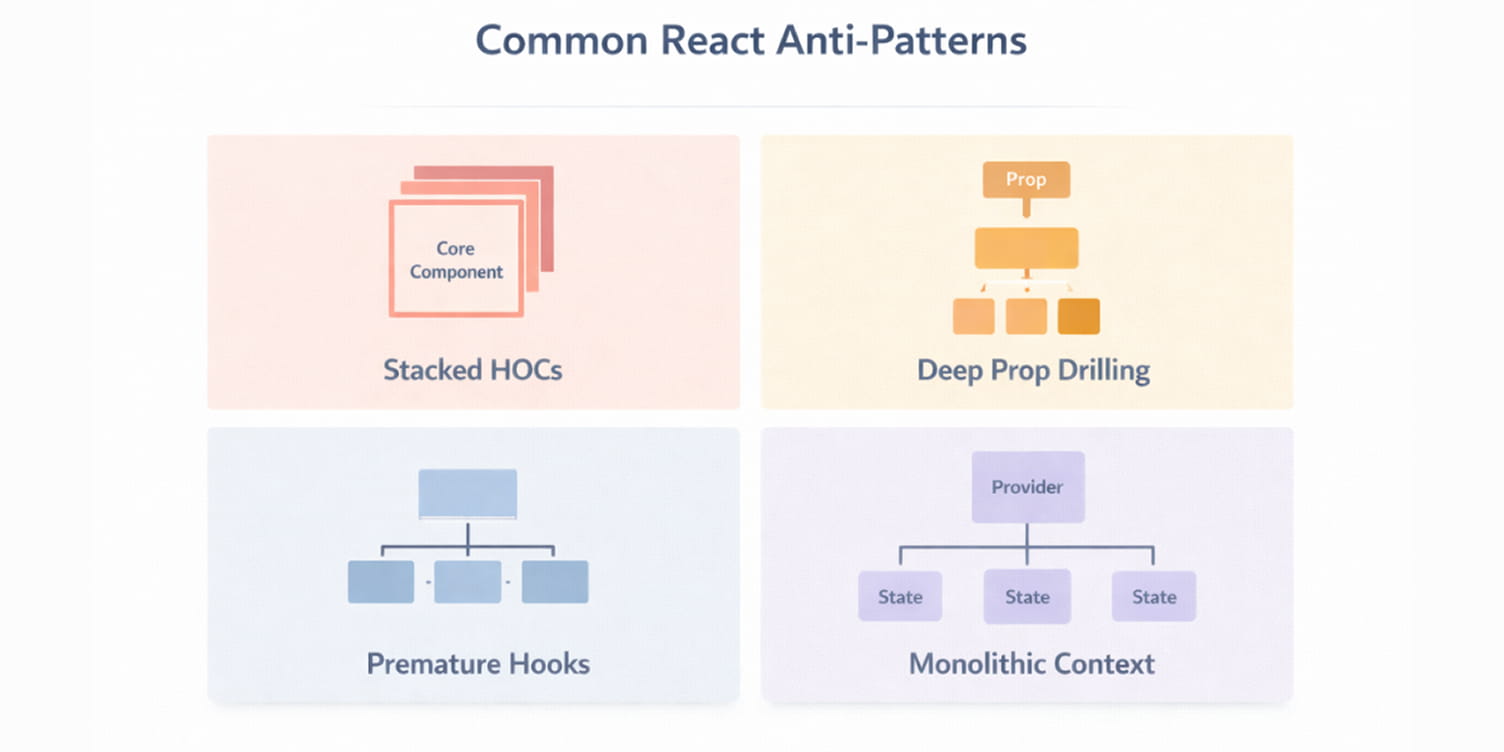
Design patterns improve structure when applied with intent. The same patterns create fragility when introduced without a clear need. Most React anti-patterns emerge from over-application, adding abstraction, indirection, or shared state before the architecture demands it.
Below are common structural mistakes that gradually weaken a codebase.
Too Many Higher-Order Components
Higher-Order Components can elegantly share behavior by wrapping a component with additional logic. But when several layers of HOCs are stacked, the component tree becomes hard to trace. Each wrapper adds an extra render boundary, complicates debugging, and obscures where props and behavior originate.
const EnhancedProfile =
  withAuth(
    withTheme(
      withAnalytics(Profile)
    )
  );
Each wrapper adds another layer of indirection. Tracing props requires stepping through multiple abstractions. Debugging becomes slower because the rendered output no longer clearly reflects the original component.
Modern React codebases typically prefer hooks or composition for behavior reuse because they keep logic closer to where it is used, reflecting the structural benefits of React’s component-based design that prioritize modularity and clarity.
HOCs remain valid, but stacking them without restraint obscures intent and increases cognitive overhead.
Deep Prop Drilling
Passing props through intermediate components that do not use them creates structural noise.
function Parent() {
  return <LevelOne user={user} />;
}

function LevelOne({ user }) {
  return <LevelTwo user={user} />;
}

function LevelTwo({ user }) {
  return <Profile user={user} />;
}
Each level now depends on a prop it does not conceptually own. Refactoring becomes more difficult because intermediate components must preserve prop chains even when their own responsibilities are unrelated.
This pattern signals that ownership boundaries may be misplaced. Either state should be lifted to a more appropriate ancestor, or the context should be scoped closer to the consuming components. The goal is not to eliminate prop passing, but to avoid unnecessary coupling between layers.
Over-Engineering Custom Hooks
Custom hooks are powerful for extracting reusable behavior. They become problematic when abstraction is introduced prematurely.
Extracting logic into a hook used by only one component can reduce readability instead of improving it. Readers must jump between files to understand behavior that could have remained local and clear.
Abstraction should follow demonstrated reuse or structural need. If logic is tightly coupled to a single component and unlikely to be shared, keeping it inline often improves clarity.
Hooks should clarify responsibility boundaries, not fragment them, as a consideration that aligns with selecting appropriate software development approaches for scalable systems.
Overuse of Context
Context solves prop drilling and provides shared data. But treating context as a default global store for all state is problematic. Large, monolithic context providers that carry unrelated values encourage re-renders throughout the tree and make dependencies implicit instead of explicit.
For example, putting every piece of state user, theme, cart, and filters into one provider broadens its impact and increases unnecessary re-renders.
Instead, split context into focused providers or reserve context for stable, widely-shared data.
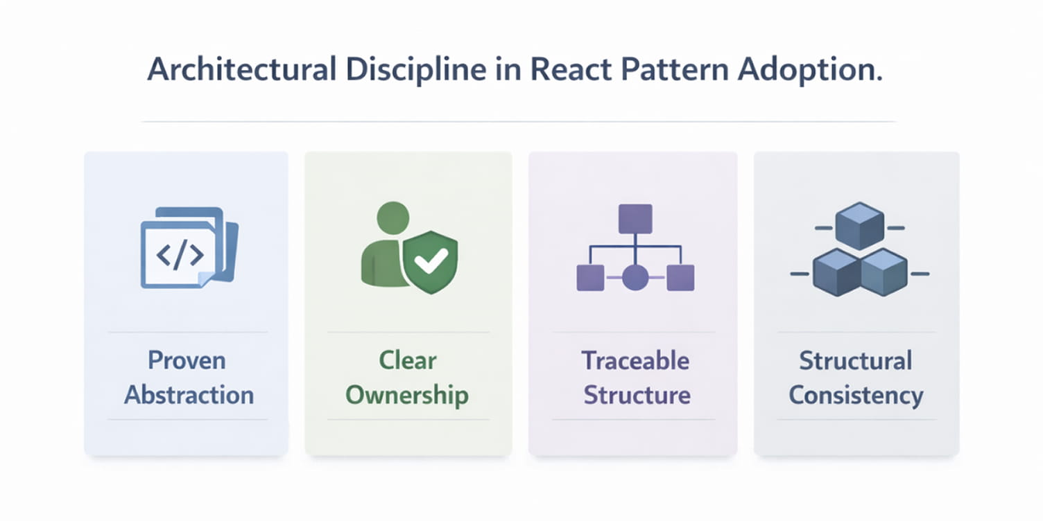
Best Practices for Applying React Design Patterns
Patterns do not improve codebases by default. They improve codebases when applied with architectural discipline, as seen in structured React development services. In mature systems, structure must justify its complexity.
The following principles help maintain architectural discipline.
Introduce Abstraction Only After Repetition Is Proven
Patterns should respond to demonstrated duplication or coordination pressure. Extracting logic before reuse establishes fragments' behavior across files and increases indirection without structural benefit.
Custom hooks, shared services, or a centralized state become valuable when multiple components depend on the same evolving logic. Before that point, locality often provides greater clarity.
Abstraction should reduce surface area, not expand it.
Maintain Clear Ownership Boundaries
Every piece of state and every unit of logic should have a clearly defined owner. Ambiguous ownership leads to unpredictable update paths and unnecessary coupling.
Lifting state, introducing context, or centralizing it in a store must reflect genuine shared responsibility. When ownership boundaries are explicit, refactoring becomes controlled and contained.
Well-defined ownership limits the ripple effect of change.
Ensure Abstractions Improve Traceability
Each additional layer increases the path a developer must follow to understand behavior. Hooks, HOCs, providers, and architectural modules are justified only when they simplify reasoning.
If an abstraction makes behavior harder to trace or requires jumping across multiple files to understand a simple interaction, it likely introduces more cost than value.
Structure should make dependencies visible, not obscure them.
Preserve Structural Consistency
Consistency strengthens maintainability, especially in environments supported by experienced software development teams accustomed to structured React architectures. When similar problems are solved with different structural approaches, the codebase becomes harder to navigate.
A predictable folder structure, a clear state strategy, and consistent composition patterns lower mental load for current and future contributors, especially when teams standardize their React development project setup and structure.
Architectural discipline scales better than architectural variety.
Conclusion
Most React applications do not fail because developers lack patterns. They become difficult to maintain because structure is added inconsistently or without clear necessity.
Design patterns in React are simply ways of controlling responsibility. They determine where the state lives, how logic is reused, how features are isolated, and how updates propagate. When those decisions are deliberate, systems remain understandable even as they grow.
There is no advantage in applying every available pattern. Adding hooks, context, global stores, or architectural layers without clear pressure increases surface area without reducing complexity.
The discipline is straightforward: introduce structure when the current design makes change difficult. If it does not, leave it alone.
Well-built React systems are rarely the result of aggressive abstraction. They evolve through measured decisions about ownership, boundaries, and coordination.
 WhatsApp
 Call Us
 Mail Us