


How to Map a Complete Customer Journey for a SaaS Product


Most SaaS teams can tell you their sign-up numbers and their cancellation numbers. Far fewer can tell you what happens in between the exact point where a paying user quietly stops logging in, or the step in setup where a free trial goes cold.
A customer journey map is how you find those leaks before they show up in your revenue reports. This guide covers the six stages a SaaS user moves through, what to put inside the map, where journeys tend to break, and a step-by-step way to build one that your product, marketing, and support teams actually use.
What is a SaaS Customer Journey Map, and How is it Different from a Sales Funnel?
A SaaS customer journey map is a visual record of everything a user does with your product from the moment they first hit a problem worth solving to the point they renew, upgrade, or walk away.
It tracks their actions, the channels they use, what they are feeling, and where they get stuck.
People often confuse this with a marketing or sales funnel, and the two do share stages. The difference is point of view.
A funnel describes what your company does to move someone toward a purchase. A journey map describes what the customer is trying to get done at each step, in their own words.
The same touchpoint say, a pricing page looks like "qualify the lead" in a funnel and "work out whether I can afford this and justify it internally" on a journey map.
There is one more difference that matters for subscription products specifically: the SaaS journey does not end at checkout.
A buyer re-evaluates your product at every renewal, so the map has to keep going long after the sale. That is why a journey map for a one-time purchase and a journey map for a recurring-revenue product are not the same document.
What Are The Six Stages of a SaaS Customer Journey?
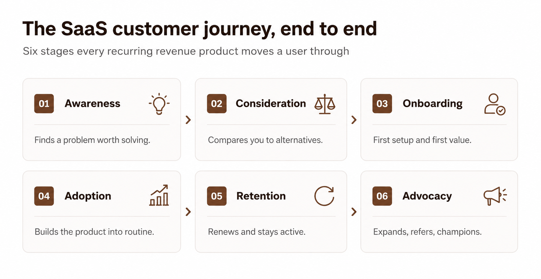
Most working SaaS maps settle on six stages. The labels vary between teams, but the shape is consistent: a user gets aware of a problem, weighs their options, gets set up, builds a habit, decides whether to stay, and in the best cases brings others with them.
A quick note on stage naming:
If you sell to both self-serve users and enterprise buyers, you may need two versions of this table, because their consideration and onboarding steps barely resemble each other.
Why Bother Mapping The Journey?
Mapping is not a design exercise for its own sake. It earns its place because it points at the stages where you are losing money, and it does so with evidence instead of guesswork.The early stages carry most of the risk.
These findings clearly indicate the importance of onboarding quality and how fast people reach value are among the highest-return places you can spend effort.
The flip side is that fixing those same stages pays back quickly. A 2026 retention study reports that a structured onboarding program lifts first-year retention by about 25%, and that teams acting on product-usage data hold on to roughly 15% more customers than teams flying blind.
A separate benchmark of 939 SaaS companies found that products getting users to first value in under seven days see churn cut by about half. Mapping the journey is how you find which of those levers applies to you, and where.
How Do You Map a SaaS Customer Journey?
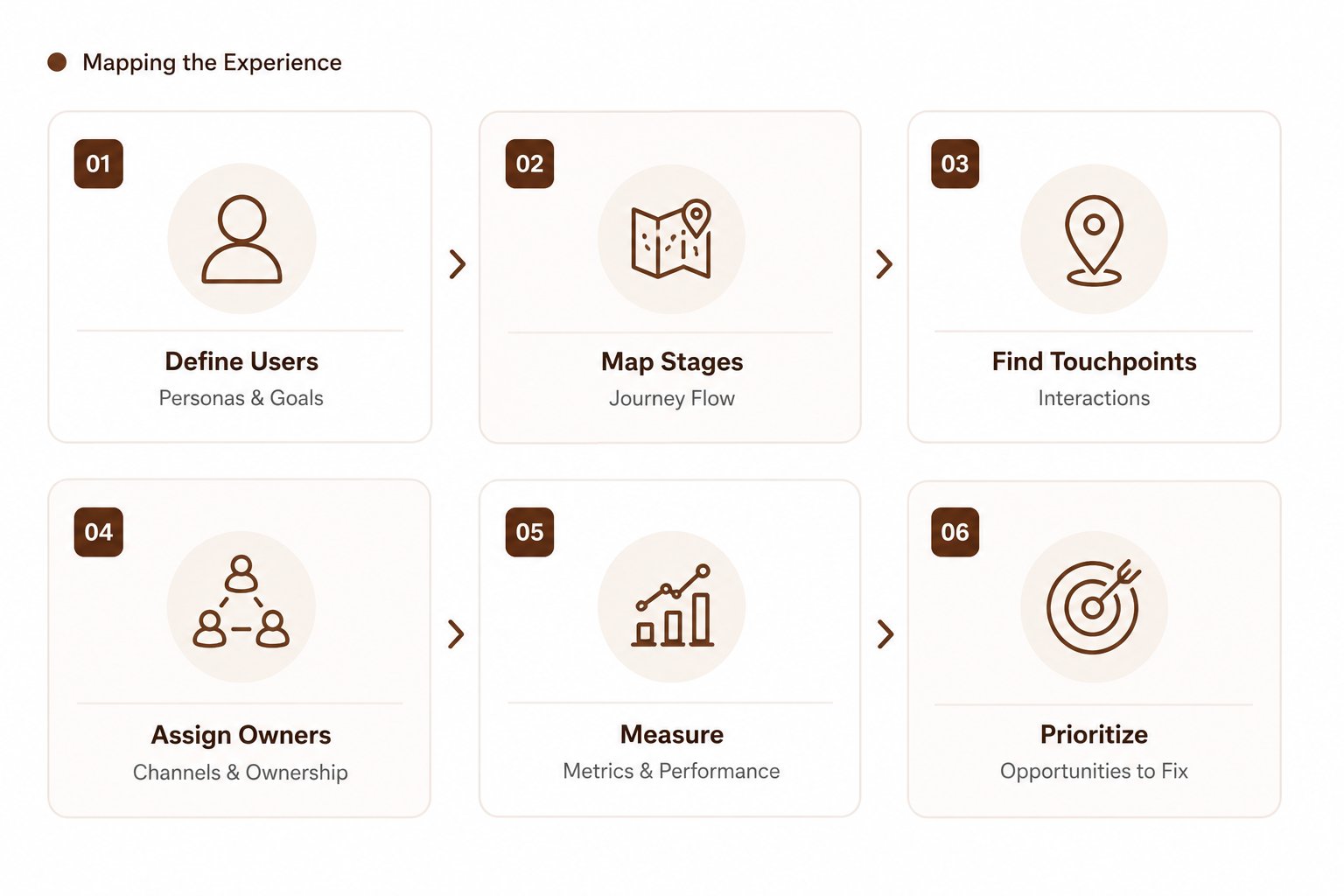
Here is a practical order of operations. It moves from understanding the customer, through evaluating where they struggle, to deciding what to fix and validating it with real behaviour.
- Build two or three real personas, not ten: Pull them from sales calls, support tickets, and product analytics not from a brainstorm. Each persona needs a job, a trigger that sends them looking, and a definition of what "success" means to them.
- Lay out the six stages along the top: Use the table above as a starting grid.
- Map the touchpoints inside each stage: A touchpoint is any specific interaction: an ad, a pricing page, a setup wizard, an in-app empty state, a renewal email. List them as they actually exist, including the ugly ones.
- Tag the channel for each touchpoint: Website, email, in-app, sales call, community, docs. This shows you which teams own which moments.
- Capture emotion and friction: For each touchpoint, note how the user likely feels (confident, confused, frustrated) and what gets in their way. Source this from session recordings and interviews, not assumption.
- Attach a metric to every stage: If a stage has no number behind it, you cannot tell whether a change helped. Borrow the metrics column from the stage table.
- Mark the opportunities: Wherever emotion dips or a metric leaks, flag it as a fix. Rank those fixes by how much revenue sits behind them.

Journey-Mapping Checklist:
✓ 2–3 evidence-based personas.
✓ All six stages on one canvas.
✓ Every real touchpoint listed, including off-product ones.
✓ Channel labelled per touchpoint.
✓ Emotion + friction noted from real data.
✓ One metric per stage.
✓ Opportunities ranked by revenue impact.
What Goes Into Each Stage Of The Map?
When teams say their journey map "doesn't tell them anything," it is usually missing one of these layers. A complete map carries all seven.
Where Do SaaS Journeys Break Most Often?
You rarely need to rebuild the whole journey. Most damage clusters in two or three spots. Use this as a fast decision tree before you spend a sprint anywhere:
Lots of trials, few activations?
The break is in onboarding. Look at time-to-first-value and the first three actions a new user has to take. If first value takes longer than a week, start here.
Strong activation, weak month-two usage?
The break is in adoption. Users got it working once but it never became a habit. Check whether your core feature is part of a weekly workflow or a nice-to-have.
Healthy usage but surprise cancellations?
The break is in retention signalling. Usage often dips weeks before someone cancels a 2026 retention study shows behavioural data catches this early, but only if someone is watching it.
Renewals fine, but no account growth?
The break is in expansion. Elite SaaS firms push net revenue retention past 120% while the average sits near 104%, according to a 2025 retention benchmark the gap is almost entirely upsell and cross-sell you are not yet prompting.
Lots of failed payments?
That is involuntary churn, not a journey problem. It is a billing fix, and it can account for a large slice of total churn on its own.
Self-serve, Sales-led, or Hybrid: Which journey shape fits your product?
The shape of your saas sitemap depends on how people buy. Forcing a self-serve journey onto an enterprise sale (or the reverse) is one of the most common mapping mistakes.
Most SaaS products land in the hybrid column, letting users start on their own and bringing in a human when the deal gets large. If you are still deciding how the product itself should be built to support that, it is worth understanding what an early build actually costs before you commit to a journey shape your roadmap can't deliver.
How Do You Keep The Map From Going Stale?
A journey map is not a one-time deliverable. Customer behaviour shifts every time you ship a feature or change pricing.
Set a standing software review monthly is reasonable for an early-stage product and bring sales, support, customer success, and product to the same table, since each owns different touchpoints.
Tie every map update to a metric so you can prove a change worked rather than relying on a hunch. The teams watching behavioural signals retain noticeably more customers than those that don't. As the map pushes changes deeper into the product, the structure underneath starts to set the ceiling on what you can ship.
It's worth understanding how multi-tenant systems are put together before the fixes pile up, because a setup that can't isolate or scale per customer will quietly cap several of the opportunities your map surfaces.
Which Part Of The Journey Can We Help You Build?


Over the years, we've shipped a fair share of go-to-market (GTM) software products. One thing we always tell prospects: think it through with a blueprint first, especially for any dashboard-based product. A well-planned user navigation flow makes the build far easier for the development team to implement and execute.
If you're looking to build an initial interface around your MVP and want a grounded sense of what actually goes into building the product, including the tech stack worth choosing in the age of AI take a look at how we approached it for one of our clients.
 WhatsApp
 Call Us
 Mail Us